Improve Your Trading with Tick and Volume Based Charts
Until the electronic age of trading emerged, time-based measure was the only choice of bar chart frame of reference to work with. Daily, weekly or monthly charts were choices for charts logged by hand, printed on paper. The advent of electronics and computerization gave us the myriad chart styles we have at our fingertips today. Many successful traders moved away from time-based measurement charts for those which plot price changes and/or volume traded alone.
Click here to order your copy of The VXX Trend Following Strategy today and be one of the very first traders to utilize these unique strategies. This guidebook will make you a better, more powerful trader.
Time Charts
A time-based chart traces the open, high, low and close prices according to time marked on a clock. There is no regard for how active or dull that period of measured time actually was. A five-minute chart’s bar measured from 12:00am – 12:05am est on an FOMC announcement day will probably look a whole lot different than the five-minute bar measuring 2:15pm – 2:20pm est. The constant in this equation is time. The major variable is price behavior inside that constant. Time charts do work, but they have limitations.
Known or unknown market-moving news events can skew a time chart with extreme bar lengths when price action goes wild. Bond futures, currency futures and emini index futures will show that consistently around major economic reports. Once that customary price explosion has printed a huge candle/bar on our chart, the next few (or many) bars to follow may be useless for awhile.
Volume Charts
Instead of measuring what happens with price action inside a given block of time, breaking up chart bars into segments measuring contracts (or shares) traded shows a different slant to the same overall picture. A volume-chart bar(candle) is completed with an open-high-low-close sequence when x-number of contracts or shares have actually traded. Now we have chart bars measuring the rate of change between volume flow rather than rate of change from time on a clock. Sometimes a subtle, but often a profound difference of view.
Peak highs and lows remain the same. However, swing highs and lows between the major marks appear much clearer when price action fluctuates from dull to wild or extreme.
ES 10-Minute Time Chart
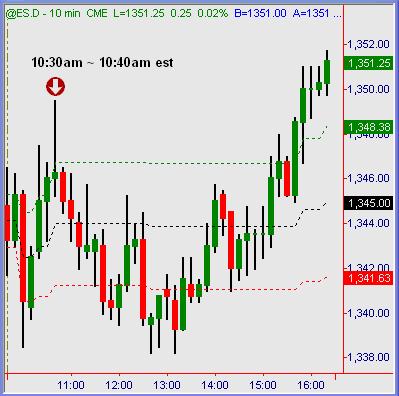
On Friday, Feb 15th there was an economic report which spiked the stock index markets. A ten-minute chart measured one bar during this reaction to scheduled news. It posted one sideways or “doji” candle along the way. Not to say that there isn’t any pertinent information to be had from that specific price bar, but waiting for it to close formation and deciding on next trade action ahead only gave one point of reference to work from.
ES 10,000 Contract Volume Chart
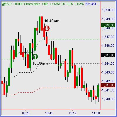
Compare that time-based view above with a 10,000 emini contract chart for the ES. We see five complete price bars, one every two minutes on average to help decipher what course of action to take on next trade entry while the time-based chart was still forming its lone price bar.
Volume charts serve to blend and smooth out staccato price action of time-based charts. Dull periods of listless price action mixed with high-volume spurts on any time-based chart will show as consolidation and spikes. Using a volume-measured chart will give a more deliberate series of bar/candle progression instead.
That likewise tends to smooth out various chart tools such as moving averages and oscillators. Volume charts tend to give clearer points of reference for measuring trend lines, channels, patterns and retracement studies. Now that the surge bars of a time chart are broken up, relative swing hi/lo points are more numerous and methodical.
Tick=Trades Versus Volume=Contract Charts
“Tick charts” form price bars by measurement of price changes rather than size of trades executed. In other words, if the ER2 price moves from 700.00 to 700.10 to 700.20 to 700.10, that would be four ticks in formation of a chart bar. If the tick chart setting is “500” per bar, it would obviously take some 500 price changes to complete each bar on that specific chart. Within that series of five hundred price changes would be an unknown quantity of volume. Some tick chart bars would have more or fewer actual contracts / shares represented than other similar bars elsewhere on the chart.
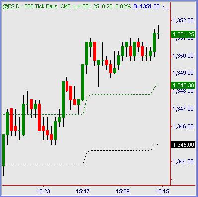
ES 500 “Tick” Trade Chart
ES 5,000 Contract Volume Chart
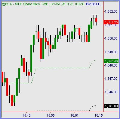
Cross comparison of a tick chart measuring 500 ES price changes versus a volume chart measuring 5,000 contracts traded shows a very parallel path of price action. Most of the time you will see tick charts and volume charts of relative measure matched up very near one another. It could be said that the average contract size per price change in ES this day was ten contracts. 500 price changes (tick by tick) x 10 contracts = 5,000 volume bars. Certainly not an exact science, but we can divide a session’s total volume (variable)Â by one-minute bars completed (fixed) equation and come up with an average number of ticks and/or contracts completed per minute. Of course, high-volume days versus dull or abbreviated holiday sessions will skew this equation greatly. Regardless, comparable tick chart to volume chart settings will plot price action so closely that it’s impossible to tell which one is what.
Summation
Through the years I’ve used just about every chart configuration possible, including P&F, 3-line break and other exotic formats. At this point in my career trading the eminis intraday, I find the most clarity and value inside tick or volume based charts. If you haven’t already done so, apply them to your current method or approach to trading. You might see more clarity and smoothness of price action measurement in these times of sideways chop interrupted by sudden program-trade slams. A slightly different view often provides an entirely new picture to work from.
Austin Passamonte is a full-time professional trader who specializes in E-mini stock index futures and commodity markets. Mr. Passamonte’s trading approach uses proprietary chart patterns found on an intraday basis. Austin trades privately in the Finger Lakes region of New York. Click here to visit CoiledMarkets.