Using Weekly Charts To Detect Stealth Buying
Pretend that you run a mutual fund with $1 billion in assets. You want to put just
1% of that money to work in the stock of a publicly traded company. That amounts to
$10 million worth of stock.
You can’t just leap into the market and buy all those shares in one gulp. In all
but the biggest companies, that would overwhelm the sellers and blow the top off the stock’s normal trading volume. Everyone with a pulse would know a giant buy is under way and start grabbing shares to exploit the resulting price explosion. In short, you’d trigger a rally in the stock, driving up the price against yourself.
When a big fund establishes a position in a stock, the managers typically spread the buy orders
over multiple trading sessions. They also look for opportunities to buy on a price weakness. These tactics
lessen the impact on a stock’s trading behavior and avoid drawing undue attention to the presence of a major buyer in the market.
But the disguise is a patchy one at best. Using a weekly price-and-volume chart can help you
discern tell-tale signs of the position-building in individual stocks by institutional investors. Look hard enough, and you’ll spot the big-money moves, no matter how hard they try to hide. Bill O’Neil, legendary trader and founder of
Investor’s Business Daily, likens the effect of institutional buying to an elephant climbing into a bathtub. No matter how gently the elephant
eases into the tub, the water level is going to rise.
As an intermediate-term trader, I use daily charts to pick apart price-volume patterns and zero in on precise pivot points to time my entries. But this level of detail also subjects the eye to a good deal
of visual noise.
Weekly charts help to clarify the situation. Instead of getting caught up in the day-to-day price volatility, I’m able to see the net result of those daily supply-and-demand battles at the end of each week.
Accumulation
On The Way Down
You may have heard the observation that prior to a correction, the savviest
institutions distribute, or liquidate, their holdings on the way up. They take
advantage of the last gasp of strong demand to unload their stocks, rather than
trying to sell into a sell-off.
The mirror image is true as well. The
smart money accumulates positions in quality when their stocks decline.
That’s what you look for — signs of accumulation on the way down.
SDL Inc.
(
SDLI |
Quote |
Chart |
News |
PowerRating) stands out as a good example. Let’s look at a daily chart first.
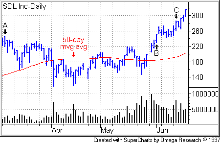
The stock peaked at 244 3/4 on March 7 (see Point A on the following daily chart), entered a correction-recovery pattern and reached new high ground on June 1 (Point B). The stock subsequently formed a handle and broke out of a 14-week cup-with-high-handle base on June 13 (Point C).
While a vigilant chartist can certainly pick out up days on strong volume, the overall picture is muddied a bit by daily price and volume volatility. What’s the net result of all this activity? A weekly chart flushes the elephant out of the brush.
Even great winning stocks go through periodic corrections before finding a bottom, recovering and charging into higher ground. But they often refuse to go down without
a fight. This shows up clearly on weekly charts. As the leader enters a decline phase, the stock will fight to end the week in the upper half of the week’s trading range on weeks on weeks when trading volume exceeds volume of the prior week.
The higher the close within the range, the better. Combined with rising weekly volume, this gives away the presence of deep-pockets institutions which are taking advantage of the price decline to accumulate the stock.
This behavior isn’t a requirement for all correction-recovery traders, but it
does raise the odds that you have a healthy leader in your sights.
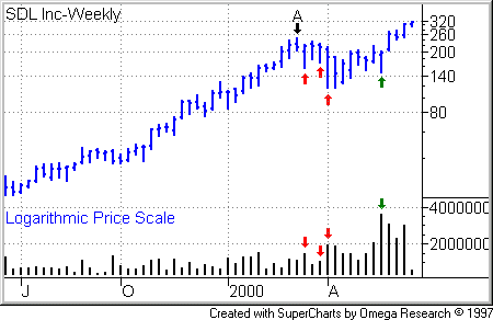
SDL showed its mettle as soon as its downtrend took hold. SDL shares peaked during the trading week ending Friday March 10 (Point A on the weekly chart.) Volume increased over the prior
week on weeks No. 2, 4 and 5 of the correction. Notice how the stock closed in the upper quarter
on each of those rising-volume weeks. (See the price and volume bars marked with red arrows.) This company had obvious appeal to the big institutions.
Before forging into new price highs, SDL sent another loud bullish signal on the weekly chart. On the week ending May 26, SDL closed near the top of the week’s range and above the
priors week’s close on the heaviest volume in its trading history. (See the price and volume bars marked with green arrows.)
As you can see in the above charts, I plotted SDL’s four-month-long daily chart on an ordinary arithmetic or linear price scale but its 12-month weekly chart on a logarithmic scale. Simple arithmetic charts work fine over short time-frames. But they tend to distort the percentage price change in a stock over very long time frames. Log charts avoid this distortion because they depict percentage price moves, not simple arithmetic price moves.
In the case of a stock that has made a dramatic advance over a long period of time, a linear chart tends to exaggerate the more recent gains and compress the past gains. Check out the following linear weekly chart of SDL, which plots the stock over the same time frame as the log chart. You’ll see what I’m talking about.
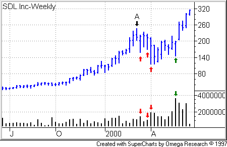
In the case of a stock that has undergone a long decline, an arithmetic chart tends to make the most recent losses look smaller than the earlier losses. For an example of this type of distortion and more on log vs. linear charts, see my column A Log In Your Eye.
America Online
(
AOL |
Quote |
Chart |
News |
PowerRating) offers
another example of weekly accumulation on the first down-leg of a correction-recovery pattern. The stock peaked on July 21, 1998, based, then
returned to new high ground in early November. All prices in the following chart
are split-adjusted.
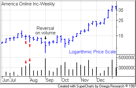
As you can see on the weekly chart,
AOL came under strong accumulation after the first week of the correction. On
weeks No. 2 and 3 of the base, the stock closed in the upper third of its
weekly price range while volume surged above the prior-week level. (See the
weeks marked with red arrows on the chart.)
The stock also gave a great bottoming
signal on the week ending Friday Sept. 4. The stock fell to a correction low of
8 5/8, then rallied to finish the week in the upper half of the range on huge
volume. That kind of bottom reversal clears out a lot of weak holders. Unhappy
shareholders with paper losses sell out and are replaced with new bullish
shareholders.
For The Best Trading
Books, Video Courses and Software To Improve Your Trading