Analyzing market volume
As I’m writing this, The Misfits are cranking out “Dig
Up Her Bones” over my speakers. That’s pretty much what I do at the end of
the market day: dig up the market’s volume bones and perform a kind of autopsy.
Below is the “brick wall” chart I posted last night in the
Trading Psychology Weblog.
The chart is from the new version of Market
Delta. It helps us dig up market bones three ways:
1) Within each 10-minute bar, we can see at each price how
much total volume was traded at each price level and how it was divided at the
bid vs. the offer. When the first number is larger than the second, the level
is shaded red, showing that sellers were more aggressive in hitting bids. The
green shading indicates the reverse: that buyers were eager to accept the
market’s offering price. This distribution of volume at each level is
helpful for the very short-term trader.
2) Vertically, along the chart’s X axis, we can the total
volume for the price bar (top number) and the net volume traded at the offer
minus that traded at the bid. That gives us a volume distribution by time.
This is useful information for short-term swing traders who track the shift of
volume patterns over the period of multiple bars.
3) Horizontally, along the Y-axis, we see cumulative volume
for the day at each price. This shows us how the market is building
volume and accepting or rejecting price as the day progresses. This is very
helpful data for longer time frame swing traders who want to compare one day to
another in terms of the market’s willingness to establish value at higher or
lower levels.
With that background, let’s take a look at the information we
can glean from the chart of Thursday afternoon’s action.
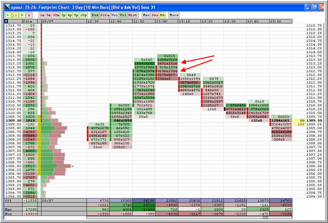
As the arrows indicate, once we hit new highs for
the day above 1313 in the December ES, large volume came in at the bid. We can
see this from the red shading of the bars in the 13:00 CT time period and also
from the magnitude of the numbers. At three different price levels, we saw more
than 3000 contracts hitting the market at its bid price.
Now let’s think like a professional trader for a moment. If you think a market
is stalling out and you might want to lighten your long position, you are not
going to rob yourself of a tick and bail out at the market. Rather, you’ll
expect that the market will trade at the bid, then the offer, then the bid,
rotating back and forth as it stalls out. You’ll work an order in the book,
offering some of your inventory for sale to see if residual buyers will do your
work for you.
On the other hand, if you’re in a rush to get out of the market and think we’re
going lower, you’re not going to play games and work an order to get an extra
tick. “Don’t be a dick for a tick” is what you’ll tell yourself and you’ll take
what the market gives you, unloading some of your holdings at the bid.
That’s pretty much how a market maker thinks. Now there’s another class of
trading professional that is less concerned with the moment to moment flow of
prices around the bid and ask. This is a longer-timeframe participant who trades
with an opinion. A hedge fund trader, for example, might have research that
tells him or her that the odds of the market breaking its low for the day over
the coming three sessions are quite high. That trader will use the rally–and
the market’s enhanced liquidity during the rise–to get into a short position
and ride the anticipated move. Given the expectations of a 10+ point move in ES,
the longer timeframe trader isn’t going to get cute and work orders for an extra
tick. If the bids are there in the book to be had, they’ll hit them and get the
position established.
When we see 5000+ contracts trading at a level over multiple price levels, we
know that this is above average volume for this time of day. The odds are great
that both of these groups of professional market participants are active. The
skewing of volume from the green to the red–from the willingness to take offers
to the need to sell shares–tells us clearly that their sentiment has taken a
sharp U turn. That’s the brick wall I referred to in my post.
When you see a brick wall, you note the price level and say “Sayonara”. There is
just too much supply relative to demand to sustain that price level. Conversely,
in later market action, if we *do* take out that price level, what better market
indicator could you have that the demand/supply equation has changed?
Now let’s go to a different portion of the chart. Along the left side, you’ll
see a volume histogram and numbers along the chart’s Y axis. What that’s telling
us is the volume that has printed at that price cumulatively through the day.
When the numbers are green, we can see that the majority of the volume at that
price during that day was at the market’s offering price. Red indicates that the
volume was at the bid. The histogram is broken down into green and red so that
we can see, not only total volume relative to neighboring prices, but also the
distribution relative to bid and offer.
Notice what happens to the histogram as we move from 1309 to the market’s high
price. We’re seeing less cumulative volume at higher prices. What that tells us
is that the market has not facilitated trade north of 1309. High volume at any
price level tells you that, over time, the marketplace is accepting that price
as value. What we have with the brick wall pattern is a rejection of value at a
given price range. The “tail” left by a Market Profile (not displayed here) is
also a tell-tale: a sign that supply overwhelmed demand on that occasion.
We also, if you notice, rejected value at the lower end of the market’s range.
That was a brick wall in a different direction: supply overwhelmed by demand.
The observant trader will note those price levels well to see which side of the
range will facilitate trade in the coming session. That will provide the
demand/supply shift cues that alert you to a market breakout.
Props, BTW, to Market Delta for the
major upgrade. There are a lot of features to the new version I haven’t yet
toyed with, but the triple display of volume breakdown–within bars at
bid/offer; vertically by time (displayed on the X-axis); and horizontally by
price (displayed by the histogram on the Y-axis)–provides a great deal of
information that is relevant to those of us who haunt the market graveyard
before the open, looking for clues to the next day’s activity.
Disclaimer from the Doc: I am not affiliated
with Market Delta; nor am I compensated or solicited for its mention. It’s a
tool I use in my own trading and that I find valuable in the education of new
traders at proprietary trading firms. I’m also not affiliated with The Misfits,
though some may find that hard to believe.
Brett N. Steenbarger, Ph.D. is
Associate Clinical Professor of Psychiatry and Behavioral Sciences at SUNY
Upstate Medical University in Syracuse, NY and author of
The Psychology of Trading (Wiley, 2003). As Director of Trader
Development for Kingstree Trading, LLC in Chicago, he has mentored numerous
professional traders and coordinated a training program for traders. An active
trader of the stock indexes, Brett utilizes statistically-based pattern
recognition for intraday trading. Brett does not offer commercial services to
traders, but maintains an archive of articles and a trading blog at
www.brettsteenbarger.com and a
blog of market analytics at
www.traderfeed.blogspot.com. His book, Enhancing Trader Performance,
is due for publication this fall (Wiley).