Improving the Odds by Trading Multiple Time Frames
First off I want to thank TradingMarkets.com for giving me the opportunity to share my experiences as a trader and offer you a no nonsense trading approach that is not only logical and eloquent in design but will give you a serious upper hand in beating the markets consistently.
My name is Don Steinitz and for some of you serious chess players out there my last name may ring a bell. Wilhelm (later William) Steinitz (May 17, 1836 – August 12, 1900) was an American chess player and the first undisputed world chess champion from 1886 to 1894.
Click here to order your copy of The VXX Trend Following Strategy today and be one of the very first traders to utilize these unique strategies. This guidebook will make you a better, more powerful trader.
My background is in professional gambling. I started counting cards in blackjack back in 1975 when I turned 18. After quickly seeing the potential for making money, I packed my bags and left California to play full-time in Las Vegas Nevada where I live today. I put together a team of player years before anyone heard of the M.I.T blackjack team players.
We were only interested in games that we could clearly obtain an edge which included but not limited to concealed body computers for blackjack and roulette. We also trained to visually see the occasional exposed card from a blackjack dealer which gave us a tremendous advantage seeing both cards, as you can imagine. Okay enough of me and my past so let’s start discussing the nuts and bolts on how to obtain a significant edge in the biggest game in the world called “Trading”.
To understand the importance of first arriving at a sound theory before implementing and testing a trading program, we need to briefly review the characteristics of performance that indicate a robust method.
When testing a trend-following system, we should expect that a trend of 100 days, compared with a trend of 50 days, will produce larger profits per trade, greater reliability, and proportionally fewer trades. As you increase the calculation period, this pattern continues; when you reduce the calculation period this pattern reverses. You are prevented from using very short calculation intervals because slippage and commissions become too large; the longest periods are undesirable because of large equity swings. There must be a clear, profitable pattern when plotting returns per trade versus the average holding period.
Each time frame has a logical purpose and is said to be modeled after Gann’s concept that the markets are essentially geometric. The shortest time frame is the one in which you will trade; in addition, there are two longer time frames to put each one into proper perspective.
The patterns common to time frames are easily compared with fractals; within each time frame is another time frame with very similar patterns, reacting in much the same way. You cannot have an hourly chart without a 15-minute chart, because the longer time period is composed of shorter periods; and, if the geometry holds, then characteristics that work in one time frame, such as support and resistance, should work in shorter and longer time frames. Within each time frame there are unique levels of support and resistance; when they converge, the chance of success is increased. The relationships between price levels and profit targets are woven with Fibonacci ratios and the principles of Gann.
One primary advantage of using multiple time frames is that you can see a pattern develop sooner. A trend that appears on a weekly chart could have been seen first on the daily chart. The same logic follows for other chart formations. Similarly, the application of patterns, such as support and resistance, is the same within each time frame. When a support line appears at about the same level in hourly, daily, and weekly charts, it gains importance.
LAWS OF MULTIPLE TIME FRAMES
1. Every time frame has its own structure.
2. The higher time frames overrule the lower time frames.
3. Prices in the lower time frame structure tend to respect the energy points of the higher time frame structure.
4. The energy points of support/resistance created by the higher time frame’s vibration (prices) can be validated by the action of lower time periods.
5. The trend created by the next time period enables us to define the tradable trend.
6. What appears to be chaos in one time period can be order in another time period.
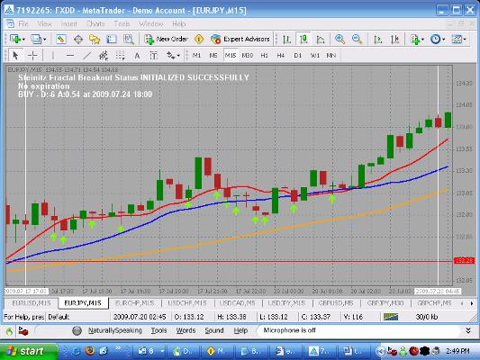
Above is the format in which I will show all my screen shots. This is what the MetaTrader 4 charting software looks like. This is the chart of the EUR/JPY (Euro vs. Yen) on the 15 minute timeframe. The 10 and 21 SMA’s are above the 50 SMA, therefore we are looking to buy or trade long. You can plot all three moving averages which comes standard with this software.
The red line is the 10 SMA, blue line is the 21 SMA and finally the orange line is the 50 SMA. The red horizontal line is another tool that comes standard that I plotted to show the relationship between the 50 SMA and a horizontal line indicating the angle or strength of the trend.
Each green arrow indicates a potential trade setup. The definition of a trade setup is whereby a candle’s upper wick is lower than or equal to the previous candles upper wick. In addition, the candles lower wick must be lower or equal to the 10 SMA. If both of these conditions coexist at the same time we have what we refer to as an alert candle.
The two white vertical lines are another tool that comes with the charting software that I plotted for reference only to show the segment of the trend that I wish to discuss.
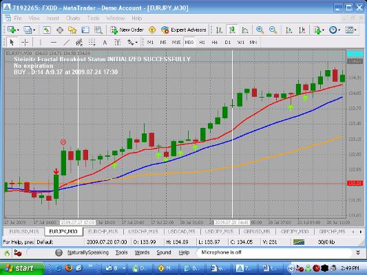
Above is the same chart except we are looking at the 30 minute timeframe. This chart illustrates what the trend looks like on an upper timeframe e.g. 30 minute timeframe. Notice the relationship between the 50 SMA and the red horizontal line. We are concerned with the angle.
Obviously, the steeper the angle the stronger the trend. In order to trade on the 15 minute chart we must confirm what the upper timeframe in this case the 30 minute chart that we do indeed have a trend in our favor. The 10 and 21 SMA’s must be above the 50 SMA as well as an upward angle of the 50 SMA itself. If any of these conditions do not exist on the upper timeframe we do not take the trade on the 15 minute timeframe and look for another opportunity.
On this chart we are not concerned with the arrows whatsoever only the strength of the trend. You’ll need to visually look at the angle between the 50 SMA and the red line to determine trend strength.
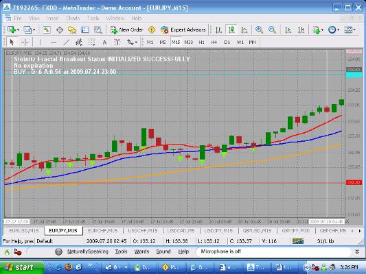
This is the same 15 minute chart except the green arrows now indicate where to take your trade. To the left of each arrow is an alert candle except in this illustration we removed the alert candle’s arrows to focus only on trade candles. The definition of a trade candle is whereby the current candles high penetrated the previous candles high (alert candle) by at least one pip.
In summary what we have accomplished is identifying a certain timeframe that’s displaying a nice trend. We drop down one time frame and look for a retracement of the market (buy on dips) and wait for a nice set before pulling the trigger.
Next article, I will illustrate the exact rules except this time I will show a down trend. We will get deeper and deeper into every aspect of this methodology that has consistently allowed me to double my account balance in two weeks trading only 10% of the equity in my account without compounding.
Don Steinitz is a full-time professional trader who designs and sells automatic and manual trading software for the Forex market at: www.forexrobottrader.com. To download a free copy of Metatrader 4 charting software please click on the following link: https://www.fxdd.com.