The 4 Staples of Interpreting Forex Price Action
One of the most challenging frontiers for Forex traders has been interpreting Price Action without the known presence of order flow. Although there are many methods which dip their fingers into the toppings of the pie and get a taste of the price action (i.e. candlesticks, Elliot wave, pattern recognition), none of them seem to get fully into the bedrock of our subject – into the actual ingredients of price action.
Click here to learn how to utilize Bollinger Bands with a quantified, structured approach to increase your trading edges and secure greater gains with Trading with Bollinger Bands® – A Quantified Guide.
What is Price Action?
Price action is essentially the closest relative to order flow in FX and across all markets. It is the direct result of order flow. Thus, it has the fingerprints of bias, speed of buying/selling, where buying and selling is occurring (support/resistance) when a breakout is genuine and where a likely reversal is occurring. From the continuous flow of price action which pours onto our charts, all indicators are born and thus dependent upon it. Hence, understanding and being able to interpret price action becomes an essential component to our trading. It is a way to get into the essence behind what creates the indicators and most technical signals in the markets.
The 4 Staples
Since there have been countless books, articles, etc. written on how to find and use support and resistance levels, lets dive into four unique methods or staples for understanding price action.
1) Impulsive vs Corrective
Elliot Wave theory had the wisdom and insight to examine the difference between moves. The two essential moves everyone sees is either an Impulsive move or a Corrective move.
Impulsive Moves
An impulsive move is characterized by a forceful or strong move in one direction. It is fast and powerful, thus producing some of the larger candles in a set albeit any time frame. It is also usually followed by several candles moving in one direction, or the bulk of them in a move. The candles are often signified by closes towards the top or bottom of the candle, depending upon the direction of the impulsive move.
They are ultimately created by a large amount of capital with the buyers/sellers coming in at a particular level with a specific direction in mind. The other scenario is they are created due to a price cascade, via tripping up large stops and, thus, removing the defenses to the upside or downside of a support or resistance level, creating an imbalance to the order books. Impulsive moves can happen on any time frame.
Figure 1 illustrates a recent impulsive dive in the EUR/USD. In this 1 hr chart, notice how the move starts with the largest candle in the entire down move and the close being towards the bottom of the candle (signaling constant selling pressure for the entire hour).
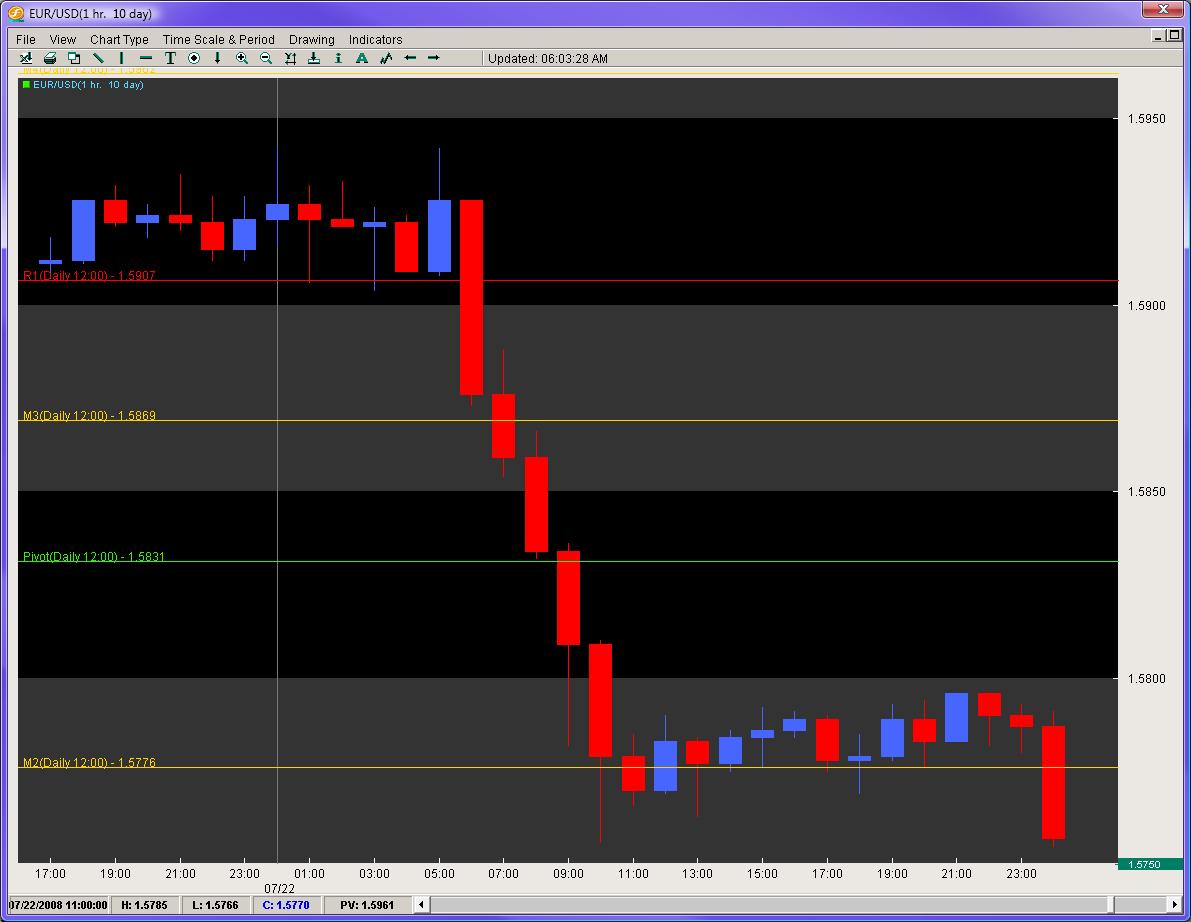
Also notice how before, the move is a mix of red/blue candles, but once the impulsive move begins, we have six red candles in a row.
This send this pair on a peregrine falcon dive from 1.5928 to 1.5756 (172 pips) in a matter of 6 hours. The daily ATR for this pair was clocking in at 133 pips from top to bottom on a daily basis, but in 6 hours it eclipsed the average daily range by almost 22%. This is a great example of an impulsive move.
These are the types of moves we want to be in. They are the moves where the order flow is most consistent and heavily biased in one direction. Its no secret the larger players move the market. Thus, being able to identify impulsive moves and riding such waves give us some of the best trading opportunities.
Corrective Moves
Corrective moves are the most common moves to follow an impulsive move. They are practically the inverse of impulsive moves. The candles are usually smaller in nature with closes not particularly aligned to the top or bottom. They are usually a mixed bag of fruit with both blue and red candles and generally have little or no bias. It is important to identify these because they are the prelude to the next impulsive move.
From an order flow perspective, they are usually created by one of two scenarios: 1) profit taking after an impulsive move with few significant buyers/sellers coming in to challenge the previous move, or 2) a clear mix of buyers and sellers residing at the same place and a potential reversal point. More often than not, a corrective move following an impulsive move is usually a continuation move.
In Figure 2 we are looking at the same EUR/USD move which displays the corrective move before the large triple landing dive for this pair, followed by another corrective move and then further selling.
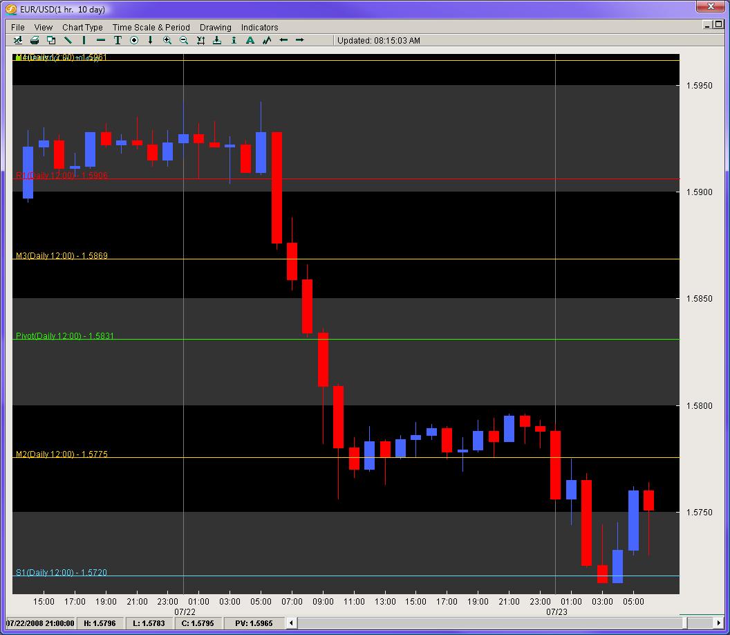
Remember, when trading, we want the order flow bias to be heavily in our favor. Corrective moves offer little bias with order books closely aligned to 50% buyers and sellers. Even in the better case scenarios with a 60/40 tilt, you still have a much higher percentage of players on the other side of the market, moving the price action in the opposite direction of your trade. Ideally, we want the highest tilt available and corrective moves in and of themselves do not offer this for us as traders.
The next two methods come from a trade I had done while working for a hedge fund.
2) Pips Gained vs. Pips Lost
In the summer of 2006, I had joined a hedge fund in California, and was on my first trader call with the President and CEO. We were discussing our trade ideas for the week, and I brought up a controversial pair – the NZD/JPY. Although I was sensing an impending reversal down the line, I was still bearish on the pair. However, the President and CEO were bullish on the pair, feeling the time for the reversal was ready to leave the womb and enter the world.
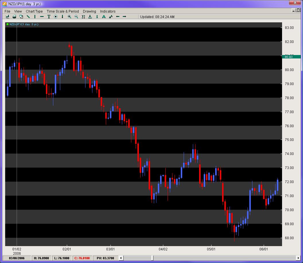
Looking at figure 3, we can see the pair was on a heavy decline from just above 85.00, falling all the way down to 68.00. The pair had bounced off the lows 400 pips to challenge the 72 figure. After a little dip, the pair re-attacked the 72 level and looked to break to the upside. There was also the presence of a small Inverted Head and Shoulders pattern which is a clear reversal pattern.
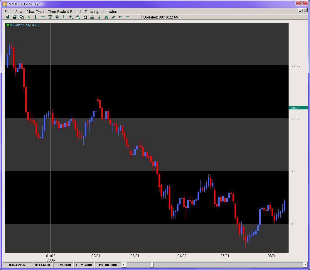
In front of all this, I still disagreed. Regardless of the top from this down move (87.05), the pair had started the year at 80.48 with the current price being 72.15 on the close of the then current day. The pair had ultimately lost 833 pips on the year. The price action had suggested for the bulk of the year, traders were much more apt to be selling instead of buying. Furthermore, using our impulsive vs. corrective analysis, the most impulsive moves for the six months of price action were clearly to the downside, with the series of moves having more consistency in the sell-offs vs. the buy-ups.
I shorted the pair while the President and CEO were against it. The pair then declined 340 pips over the next two weeks. Longing the pair at that time was clearly not the option.
Thus, we can see how measuring pips gained vs. lost gives an insight into where the previous buying and selling had occurred and where the next likely move is. Another stellar example of this is the USD/CAD.
In the late summer of 2007, the USD/CAD (figure 4) had started to show some bottoming after a torrential sell-off. After some consolidation, the pair sold off from 1.1800 to 1.0400 in a period of 4 months. This was a merciless move that could find nobody willing to step in front of the locomotive selling. The pair finally found a decent floor after bouncing off the 1.0400 handle and settled between 1.0500 and 1.0700. At this time, hundreds of technicians and economists, still baffled by the overextended downtrend and momentum of this move, were calling for a reversal, at least in the short term. Now consider some very important questions using the pips gained vs. lost method.
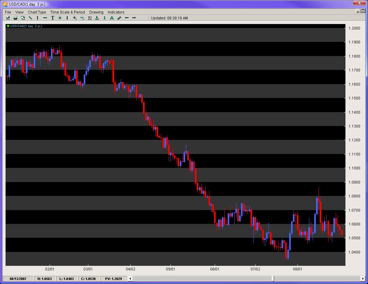
The pair sold off roughly 1400 pips in 4 months and was down about 1100 for the year. On top of that, it was only 4.5 years ago the pair was at 1.6000 (5500 pips ago) and had yet to complete anything greater than a 50% retracement of any major leg, with each retracement going to its corresponding extension. In light of all that, why in the world would anyone be paying attention to indicators and their over-extension since the pair had no regard for them? Furthermore, who in the last 4 years made significant money buying the USD/CAD? And since the order books/price action were completely dominated by an overwhelming pips lost vs. pips gained, who could even think about buying or a reversal until we have a clear bottom, albeit an activated reversal pattern or a 61.8% fib break of any major leg? The answer was obvious – keep selling until proven otherwise since that is where the price action had reigned king and had yet to be dethroned.
Measuring pips gained vs. pips lost gives us a pure look at where the order flow is most consistent leading up to the current day/time. This method is very powerful over longer time frames, but is incredibly helpful on shorter intraday times as well. Be wary of trading in front of serious moves where the pips gained vs. lost is against you.
3) Counting Candles
Counting candles in a series or leg of a move can be useful on many fronts. First, it can tell you how many weeks/days/hours/minutes a pair has been bought up or sold off. If you are looking at an entire year, this can be very helpful in identifying where the clear buying/selling pressure is likely to continue. Even on intraday moves, this has potency. It also gives you a rough idea for a particular leg, what the percentage is you will make money on that candle, or lose money.
A look at figure 5 ushers some insight into this. Looking at our NZD/JPY daily chart, while heading into this trade, for the year the pair had 59 red candles and 52 blue candles. That meant on any given day up till that point in 2006, there was about a 50% chance of making money if you entered and exited the position on the beginning and ending of each day. However, using the pips gained vs. lost method, the 50% became much more heavily weighted to the downside suggesting if you sold on any day and were correct, you would make more money. The counting candles gave us an initial % value to the likelihood of our trade being successful, but combined with another method, increased the value of our short position significantly.
4) Time Variables
Pattern recognition and Elliot wave methods do a solid job of bringing in time variables into trading, but they leave many details into question. Two methods to working with time variables are listed below.
a) Time lapse/display for patterns
When looking at a pattern, albeit Head and Shoulders or IHS, wedges/triangles, or even consolidations, it is important to examine the time lapse/display involved and how it should play itself out.
The GBP/JPY from late 06′ to the beginning of 08′ was forming a large Head and Shoulders pattern. This was heavily watched by technicians as the break was suggestive to be massive with the distance between the head and neckline roughly 2900 pips. What was more interesting was the time displayed in the formation of the pattern.
Looking at figure 6, notice the vertical lines which identify the touchdowns where the beginning and ending of each shoulder was made. The left shoulder from initial floor around 221.41, to its rise and fall back down to the same level took about 4 months and 3 weeks. What was tough for traders to figure out was when the right shoulder was forming, particularly if the second touchdown on 221.41 in late November was going to be the last stand at the OK Corral. Notice how the pair bounced just a bit, and then re-attacked the same price level to easily break it the 2nd time around. When the RS was forming, the space or time displayed between the 1st/2nd touchdown was only about 3 months, yet the initial LS took 4 months and 3 weeks suggesting the RS should take about the same amount of time to form.
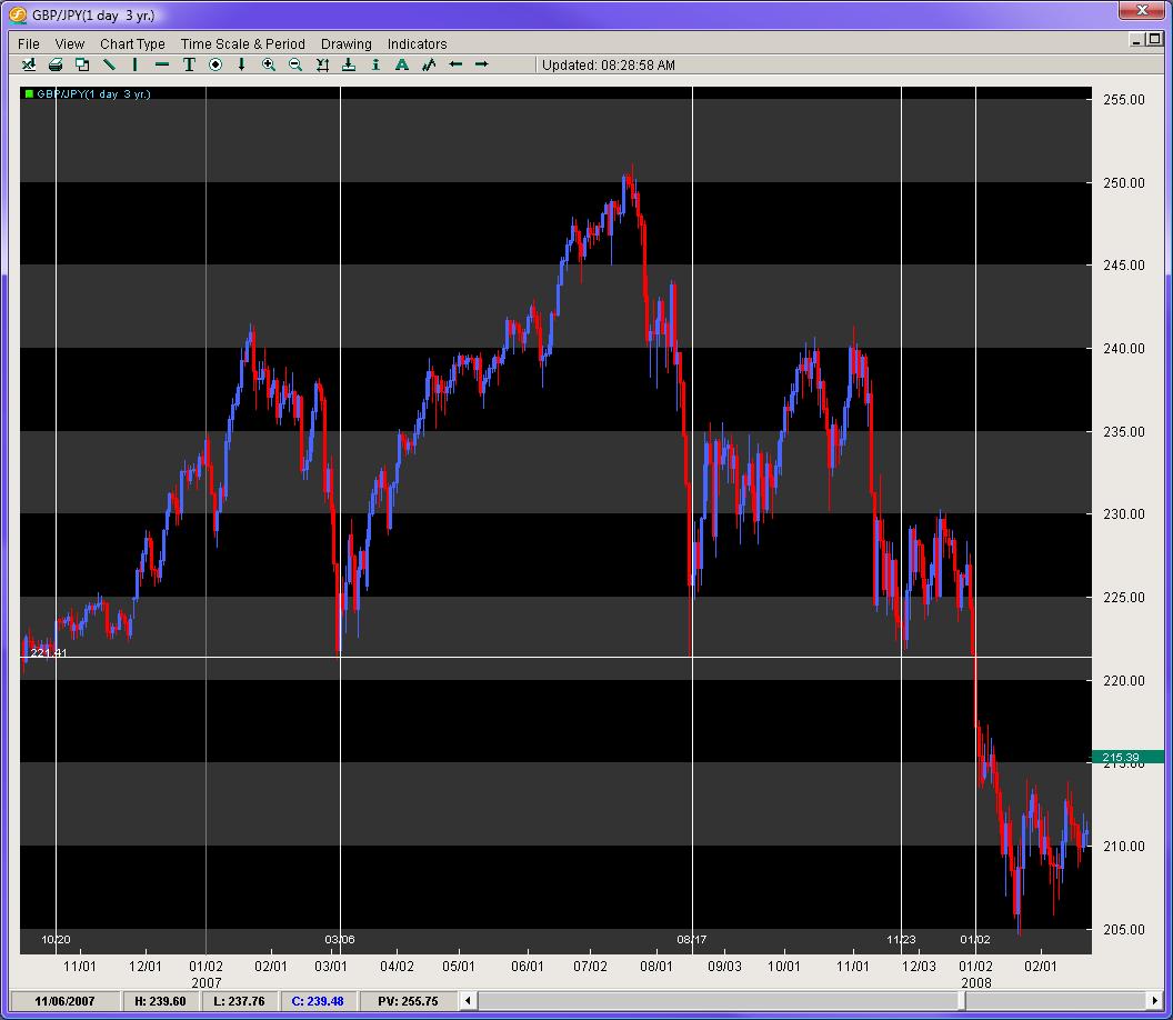
If you look at when the pair finally activated the break of the neckline, the time lapse or display was 4 months, and 2.3 weeks. This is very common amongst patterns – to have a consistent time lapse or display within themselves. Some other notables are wedges and triangles which usually complete or exit their patterns between 2/3rds and 3/4ths of the move. Rarely ever do they go to completion.
b) Length of consolidation
One other important time variable is how long a consolidation is forming. The larger the consolidation, the greater the probability the ensuing breakout will be legitimate and powerful. Breakouts are such a mystery to so many traders. Measuring the length of the consolidation can provide us powerful insights into this trading conundrum.
Taking a look at the EUR/USD in figure 7, on July 10th, 2008 the pair had opened the European session at 1.5724, dipped to the round number at 1.5700 and then come early NY session was bought up in solid fashion up to the 1.5800 handle. This 100 pip move occurred over 3 hours, where it not surprisingly tapered back a bit at the London close. The pair then consolidated from 9am PST within a 36 pip range for the next 18 hours.
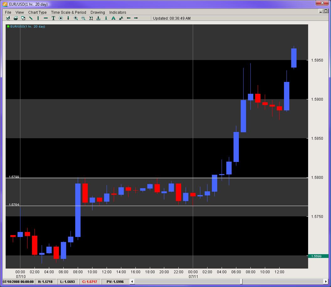
While it is not surprising there was no breakout during the Asian session, what is interesting is that from Noon – 4pm EST, where there is still plenty of liquidity, the pair could not find any new buyers/sellers. For the next 13 hours, the pair still trotted in place not just through the Asian order books, but also through the first four hours of the European session. That means through three sets of different order books/interest, the pair was hemmed in a 36 pip range and nobody could alter this for a total of 18 hours. When you see a consolidation for that long a period of time, expect a significant breakout to occur.
The following breakout gave us a nice retest of the previous resistance level and then generated a 160 pip move in roughly 4 hours. This was the largest single day climb of the week and ironically followed the longest consolidation of that week.
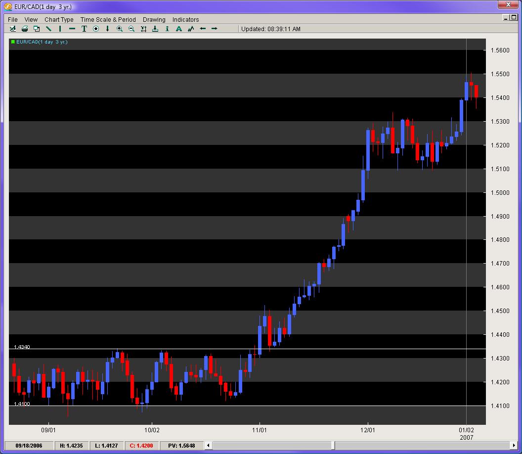
One last example of this method can be delivered via the EUR/CAD (figure 8). In the fall of 2006, this pair had entered a really tight consolidation between the end of August to the beginning of November, encroached between 1.4060 – 1.4350 (290 pip range). This was the tightest 60 day plus range over the last 4 years. With the Bollinger Bands applying their python like constriction, a large breakout was calling out to most traders. When the pair finally did breakout, it gave us a handsome retest of the previous 70day resistance level, and then went on a Himalayan trek for a 1000 pip climb in only one month. Being able to identify long consolidations can point us towards legitimate and powerful breakouts.
In Summary
Although there are many great methods for gleaning solid information out of price action (candlesticks, Elliot wave, pattern recognition), it is important we reach deeper into one of the most unexplored areas of technical analysis – that of understanding and interpreting price action. Being the closest relative to order flow and the mother of all technical indicators, a continual and intensive study of price action can only provide us with some of the most important gems of information to support our trading decisions.
The 4 staples or methods listed above are designed to give the traders a unique set of tools for approaching their charts and building a recipe for solid trades. Through the lens of these and other methods, ones trading can be vaulted to another level of insight, ability and success in trading the FX market.
Chris Capre is the Founder of Second Skies LLC. He has worked for one of the largest retail brokers in the FX market (FXCM) and is also the Fund Manager for White Knight Investments (www.whiteknightfxi.com/index.html). He regularly teaches classes at FXStreet.com, speaks at various trading conventions and each month successfully teaches traders how to become consistently profitable via his Sniper System. For more information about Chris Capre, his services or his company, visit www.2ndSkies.com.
