6 Charts Every Forex Daytrader Should Watch
Daytraders, whether stocks, or currencies… live for excitement. However, with the thrill of quick intraday profits also comes stress, something many realize over time. What’s more, with many time-frames to chose from, many new-traders find themselves confused about which charts they should be looking at. Here we will attempt to clarify what timeframes work best in Forex trading – for daytraders – while also attempting to recognize the stress that comes with moving in and out of positions quickly.
Click here to learn how to utilize Bollinger Bands with a quantified, structured approach to increase your trading edges and secure greater gains with Trading with Bollinger Bands® – A Quantified Guide.
Defining Daytraders
There are really three types of traders: daytraders, swing traders and position traders. Position traders attempt to move in and out of currencies with a longer-term view (like weeks, or months) in mind. Swing traders usually hold positions for days, or week, but aren’t really trying to build a larger position to capitalize on a macro trend. Conversely, the conventional definition of a “daytrader” is someone who attempts to book quick profits several times over – all in one session, or sitting.
With the latter in mind, daytraders will usually look at 60-minute, 30-minute, 15-minute, 10-minute, 5-minute and 1-minute “tick” charts. And with so many choices, even on an intraday basis, the stress of “what time frames work best” can be incredibly cumbersome.
What traders must realize is that there is no true “holy grail” timeframe for intraday trading. In other words, there isn’t one particular timeframe that will constantly show profitable trade opportunities. However, by overlapping several timeframes, intraday traders stand a better chance of seeing real trade setups.
Macro to Micro
It’s always important for traders to know the macro trend, before ever trying to zero in on a trade. Imagine this as similar traveling with a compass. If one were lost in the woods, he, or she would stand a much better chance of finding their way out if they knew what direction they were heading when they started hiking and may be able to simply reverse directions to find their way out. And the macro trend is exactly that, a guidance tool to help traders find their way. Thus, it’s important to look at monthly, weekly, daily and 4-hour charts (if even for a moment) to have some idea of the larger trend. While we won’t cover breaking down the larger trend in this article, it is something that traders need to be aware of. Now, we will look at the pros and cons of shorter-term charts, evaluating each for optimum intraday profitability.
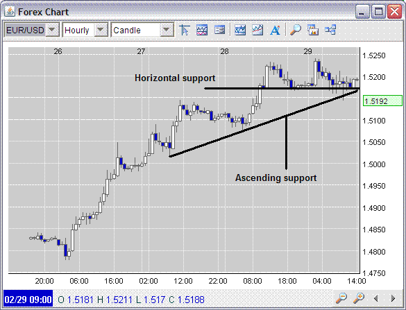
60-Minute Chart
The below 60-minute chart shows the larger short-term trend in the EUR/USD that traders would want to be aware of. Using simple a simple trendline and horizontal support, we can see that if the EUR/USD were to break the 1.5167 region, both the ascending trend and horizontal support would be breached. Of course taking a position without looking at larger timeframe charts would be slightly irresponsible, the 60-minute charts does give us some idea of the market’s mindset, which as the below chart, infers buying strength in the EUR/USD. Intraday traders would most likely want to look at the 60-minute chart for trend analysis, however, zeroing in on smaller timeframes would help locate more optimal entry and exit points.
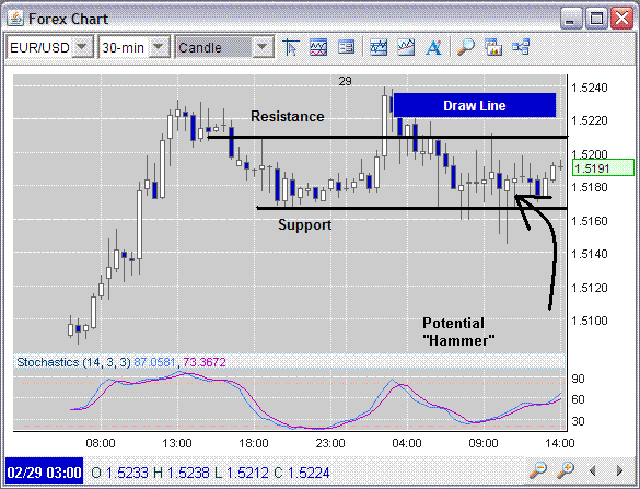
30-Minute Chart
Now, drilling down into the 30-minute chart, traders see even more detail about current trading. The 30-minute chart shows us that in the current ascending trend, support at the 1.5167 area has been breached several times, though 30-mininute candles failed to close below the aforementioned level. What’s more, there is also a “hammer” in the range, which may indicate another leg up in the currency. One additional item that the 30-minute chart shows us is the EUR/USD is trading mid-range in the relevant trend. And this is precisely where drilling down into shorter-term timeframes intraday can help traders make (or avoid losing) money.
If you’re like me, or just about every other intraday trader I’ve met, there’s one thing we all lack: patience. It’s hard to just sit there waiting for a trade opportunity to occur. Thus, we can often jump in a trade, just to be in, especially if we see a larger trend in place. The problem is Forex is volatile, and if we do not make sure we are entering each trade with the highest possible entry probability, market volatility will likely shake us out, even if we’re right over the long haul. It’s frustrating to be patient, but it will pay off.
The 30-minute chart thus shows that taking a position either long, or short at present levels, would mean entering mid-range. Really, what we would have is a high risk-to-reward trade. In the end, when we trade mid-range, we’re giving ourselves a 50/50 chance of winning, something that will eventually get us in the end.
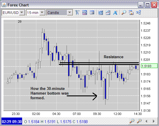
15-Minute Chart
Narrowing in one step further, the 15-minute chart begins to show us even more about what’s happening within the current trend. While the 30-minute chart showed taking a position long, or short here would be irresponsible, the 15-minute chart actually indicates something slightly different. What we see is resistance in the 1.5195 area. What’s more, it’s important to remember that whole numbers always serve as additional resistance, and the 1.52 level is just a smidge beyond actual resistance. You may have noticed that my tone has switched to a long bias, and I’m no longer talking about a short-trade. This is because the overall trend is up, as seen in the previous 60-minute chart. And “the trend is your friend.” As Forex traders, we do look for contrarian “mean reversion” trades, but in the current case with the EUR/USD, the pair has not moved up so boldly that an overly apparent overbought scenario is present. Thus, we are thinking “buy”, at least until the market shows something different.
With all of the aforementioned in the back of our minds, if we are patient, we may have a great long entry looming, as seen on the 15-minute chart. What intraday traders would look for is a 15-minute chart close above whole-number resistance, thus indicating a range breakout. One problem with waiting for the 15-minute close though, is that in 15-minutes time, the market could make a huge move, and we could possible miss the opportunity upwards, if a torrid breakout were to occur. It’s important to note that missed money is always better than lost money, but we don’t want to sit on the sidelines forever. So, to overcome this issue, we will move to the 10-minute chart to look for an entry.
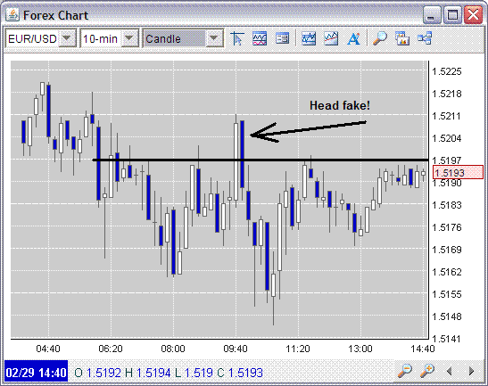
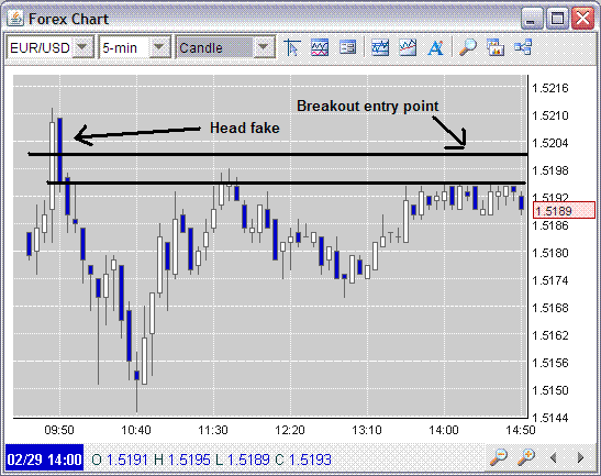
10-Minute Chart
Glancing at the below 10-minute chart, we see something that the 15-minute chart failed so show us. The previous breakout (read: head fake), likely smoked a ton of traders. The cold, hard truth about Forex is that head fakes occur all the time, and for intraday traders, they can be our worst enemy. When the 10-minute bar previously closed above 1.52, the occurrence probably sucked in many traders long. However, because the EUR/USD did not immediately move up, those same traders began dumping their intraday positions, thus causing the pair to fall back into the range. Long traders lost.
In the previous section, I mentioned that we would look for an entry on the 10-minute chart, but it’s not here. What the chart does show us though, is what we should be defensively looking for, if and when we do take a position. We now know that even if the pair were to break above 1.52, a head fake could still occur, and we certainly don’t want to be along for the ride. So what’s the solution? The 5-minute chart may show…
5-Minute Chart
The 5-minute chart begins to shed even more light on the trade set up… We see that in the first 5-minute bar after the recent head fake, the candle immediately reversed direction and fall back into the previous bar’s range. This, of course, would have been the first red flag to dump the trade. See, as a sort of unspoken rule, if momentum in a breakout (or breakdown) is truly real the bars following the breakout, or breakdown should open and close subsequently higher for the breakouts, and lower for the breakdowns. If momentum is real, there would be no retracement in the previous candle’s range. Thus, once the five minute chart proves a close above $1.52 again, traders could implement positions. However, should the following bar indicate a retracement, it would be in our best bet to close the trade. One strategy many traders use, instead of looking at the candles to stop our of the trade, is to simply put a 10 PIP stop at the entry point, based on the entry. In this case, if we were to implement a position at (for example) 1.5206 (we would likely have to pay up at the ask), our stop would then be at 1.5196. However, if the pair were to fall back into the 1.52 area, most market maker bids would likely be at 1.5196 (or lower), and would trip many people’s stops, even though the EUR/USD isn’t actually printing at that level. What happens is the stop-tripped selling then halts breakout momentum and forces a reversal. To avoid this problem, we would want to open our stops just a slight bit more, to 15-PIPs, thus forcing the EUR/USD to actually print below the whole number, before we are electronically stopped out. Keep in mind, this strategy would mean the loss would be greater; however, if the pair were to momentarily dip, just after the breakout, it would also keep us in the trade. For those using candles though – and those who like jittery high stress trading, the 1-minute chart may be the key to riding the wave of breakout momentum.
1-Minute Chart
True momentum daytraders will like what they are about to see. In the below chart, when the EUR/USD previously staged a breakout, the 1-minute chart constantly proved higher lows. For traders who like to move in and out of the market quickly, and can handle the stress, once the EUR/USD breaks (assuming it will) the 1.52 level, they could immediately implement a position and ride it up so long as the 1-minute chart constantly shows higher lows. The second a lower 1-minute low falls below the low of the previous candle, it would be time to get out! Keep in mind the trade setup came from larger timeframe charts, however, momentum jockeys would use the 1-minute chart to try to ride the wave.
From my experience this type of trading is highly stressful and leads to small wins. The problem is that most 1-minute chart traders eventually break the high-low stop rule, and take a big loss, wiping out all small wins. However, those who are able to trade with steadfast unemotional money management rules can do well with this type of “hyper-trading.” I know I can’t though, because I’m only human and from time to time, even I break my own rules.
At the end of the day, intraday trading is stressful – period – something that super-fast-in-and-out traders need to be aware of.
Exit is everything.
Mark Whistler is the founder of WallStreetRockStar.com and is the author of multiple books on trading.
Mark’s newest book, The Swing Trader’s Bible (John Wiley & Sons, Inc.) – co-authored with CNBC/Fox News regular guest Matt McCall – will be on shelves in late summer, 2008. In addition, Mark also writes regularly for TraderDaily.com and Investopedia.com.