Calculating And Using RS Lines For Intermediate-Term Trades
I’m a techno-fundamentalist (to borrow
the phrase of the great Nicolas Darvas). But if you denied me access to the
fundamentals, I still could trade on the technicals alone. Just give me charts that display price and
volume bars and a relative strength line.
Relative
strength is the price performance of a given security or group of securities
vs. a set of securities or an index. RS forms a cornerstone of
momentum trading. It often plays a role in short- and long-term
trend-following strategies as well.
A number of studies have isolated high
relative strength as a distinguishing characteristic of the biggest winning
stocks. Simply stated, stocks that have already outperformed the market by a
significant margin stand the best chance among their peers of leading the
market in the future. Likewise, stocks that lag the market tend to trail in the future.Â
In this lesson, I’ll tell you how RS
lines are calculated and used by intermediate-term momentum traders. Practical
stuff. For an introduction to the general
concept of relative strength, see my tutorial, Relative
Strength: The Profitable Trader’s Edge.Â
Don’t confuse Relative Strength
with the Relative Strength Index. RS and RSI
are completely different
animals.
RS measures a stock’s price performance against the market; RSI measures a stock’s performance against itself. Broadly speaking, extreme RS readings tend to confirm if price is trending in the same direction while extreme RSI readings signal a possible reversal ahead.
I consider relative strength more important than
fundamental performance. Most of my buys exhibit superior fundamental growth, sound
chart patterns, accumulation and strong intermediate-term price uptrends as well
as high relative price performance. However, I will sometimes go long a stock with poor earnings performance or even losses if it
displays exceptionally high relative strength. I will
never buy a stock with mediocre or laggard relative strength no matter how
“impressive” the fundamental variables.
Tabular Measurement
Technicians have come up with number
of formulas for measuring relative strength, but they generally fall in one of two camps: tabular and graphical.
I use the former to run my initial computerized screen of stocks, the latter in
my manual chart analysis.Â
Percentile
ratings are the most popular tabular
measurement of relative strength. TradingMarkets StockScanner
and FundScanner
employ percentile RS scoring.
A stock with a 12-month RS score of 80, for instance, appreciated more by
percentage than 80% of all other stocks in the TradingMarkets database over the
past 12 months. A stock with a six-month RS score of 15 outperformed only 15% of
its peers over the past six months. In other words, the stock lagged 85% of its peers over that timeframe. The FundScanner runs
similar scores within a universe of mutual funds and exchange-traded
funds.
Another interesting ranking system was
invented by the late George Chestnutt. Chestnutt’s original work on
relative strength helped him turn his American Investors Fund into one of the
top-performing mutual funds in the late 1950s and 1960s. His ranking method computed
an average of moving-average price slopes over different timeframes. Candidate
buys had the highest positive composite slopes. I learned of this system from
Warren Greene, a friend and colleague of Chestnutt. Warren now is a senior
vice president of TrendLogic Associates and uses relative strength to
rank and invest in no-load mutual funds.
Many of you are familiar with the
percentile-based relative strength system developed by William
O’Neil and featured in his newspaper, Investor’s Business Daily,
and his Daily Graphs chart service. In passing, I should make a point
regarding the O’Neil RS ratings and those of TradingMarkets. Some of you have written
in to ask why our 12-month RS scores stocks differ from O’Neil’s, which also
rates 12-month performance. We have different RS rating systems. Our formulas
are different. The stock universes populating our respective databases overlap but are not identical. For example, as of the Feb. 8, 2001 close,
Insight Communications
(
ICCI |
Quote |
Chart |
News |
PowerRating) had a 12-month RS score of 97 in the
TradingMarkets database and a 98 in IBD; Cardinal Health
(
CAH |
Quote |
Chart |
News |
PowerRating) had a
12-month RS of 82 in TradingMarkets, a 92 RS in IBD.
I’ve used both RS systems in my trading. I don’t get hung up on these differences because I don’t use tabular RS
scores as a mechanical buy or sell signal. (I don’t know any trader who does.) I
simply use RS scoring as a screening parameter to generate lists of high momentum stocks.
Then I still must vet the fundamentals and charts of all stocks on those lists.
For the final word on whether each stock’s relative price performance passes
muster, I look to the relative strength line.Â
Graphical
Measurement
Relative strength lines represent a
graphical form of display. The formulas calculating RS lines vary among charting
services, but most represent some version of the following. The chartist divides
the closing price of the displayed security by the closing value of some market
proxy, such as the S&P 500 Index, for every period in the chart. This
generates a series of quotients or ratios which are plotted on a chart. The vertical axis is governed by the quotient value and the horizontal axis
governed by time.
In most chart displays, a rising line indicates the displayed
security is outperforming the market proxy. A falling line shows the security is
lagging the proxy.
Relative strength lines have appeared in
stock charts for decades. The venerable Securities Research
Company, a provider of
subscription chart books since 1933, introduced its relative strength line,
called the Ratio-cator Curve, in July 1950. Hard copy chart books have used a
variety indexes for the “base instrument” or “market proxy.”
The Ratio-cator compares Nasdaq stocks against the Nasdaq Composite Index for
Nasdaq stocks and New York Stock Exchange stocks against the Dow Jones
industrials. Mansfield Stock Charts, Daily
Graphs and IBD base their RS
lines on the S&P 500.
If you use charting software, you
probably can construct your own RS line based on your chosen base instrument. For
those of you who use Omega SuperCharts or Omega TradeStation,
I’ve included steps on how to create an RS line using the software’s Analysis
Techniques functionality at the bottom of this lesson.
You also can produce the equivalent of
an RS line using the stock charting on TradingMarkets. Pull up the chart for
your stock and click on Show Controls, and set the Timeframe, Price
Display and Frequency to your taste. In the Compare to Indexes
drop-down menu, choose the index of your preferred base instrument. Then under
one of the three Indicator drop-down menus, scroll
down and select % Compare. Then click Go. Your chosen index will appear
in the same field as the price. The relative strength line will appear in the %
Compare indicator field below the price field.
You should be aware, though, that the %
Compare line is inverted. A falling line
means your chosen security is leading the base instrument; a rising line means
your security is lagging the base instrument. So if you use this feature for
reading charts, you’ll need to apply the opposite rules to interpreting a normal
RS line.Â
All the
trading guidelines in this lesson are for intermediate-term
momentum trading and assume a normal RS line that rises when a stock
outperforms, falls when it underperforms. My charts use the S&P 500 as
the base instrument.
Trading with
RS Lines Â
For more than half a century, market
professionals have known that RS lines are particularly effective with growth
stocks. Tom Schofield at Securities Research Company kindly provided me a photocopy of SRC’s July 1950 chart book,
the first edition to feature the Ratio-cator. Explaining the new indicator to
subscribers, the book noted: “Another outstanding feature is that the Ratio-cator
has been persistently gaining on the market as a whole as is typical of
growth issues.” (Emphasis added.)
Bob Walsh, who manages $45 million in
assets as a portfolio manager for Herndon Plant Oakley Ltd., has used technical
analysis, including relative strength, since the 1960s. However, he notes that the RS line tends to lag
big moves in cyclical stocks. “Take the
autos,” Bob told me. “I have more trouble with the autos than any
other group I work with because they V when they recover. They either are everybody’s
favorite or everybody’s enemy. You’re going to have the stock appreciably higher
before the relative strength line kicks in. It’s going to be late.”
Risk
Traders also should be aware that high
relative strength stocks impose a price for their potential exceptional
performance. When a high RS stock gets in trouble, the sell-off is often far
more vicious than the punishment meted out to mediocre or laggard stocks. By
definition, high relative strength stocks that have put in long uptrends reflect
high positive expectations. They’ll fall hard if the market
turns pessimistic. So you must practice vigilant money
management if you’re going to fish in these waters.
Confirmation
Your primary indicators are price and volume. The RS line is a powerful interpretative indicator, but it remains secondary to the trading action of your target stocks and positions. For long trades, your stocks should have established clear uptrends in price, confirmed by an
upward sloping RS line. At the time your watch list stock breaks out of a
correction-recovery pattern or consolidation area, the RS line should move up
and enter new high ground or be very close to new high ground on a six-month
basis. That’s minimum. It’s even better if the RS line breaks into new high
ground over a longer timeframe.Â
The sharper the upward slope, the better. The sharper the slope of the RS line between any two points the
more the stock is “gaining on the market” over that timeframe.Â
In contrast, stocks that correct, then
initiate price recoveries without confirmation in the relative strength line often fail.
Walsh has seen it for more then three decades. “There’s many a time that a stock has come down from from 20 to 10 and goes up to 12, but the relative
strength line
doesn’t accommodate,” Walsh said. “That stock is probably not going to back to 20.”
The following chart shows the
Jan. 16, 2001 breakout in Sodexho Marriott Services
(
SDH |
Quote |
Chart |
News |
PowerRating). The top field uses a logarithmic price scale and displays a 50-day price average in
red and 200-day price average in black. In the second field, a
blue relative strength line represents the displayed security’s price
performance relative to the S&P 500. The third field displays daily
volume bars in black with a 50-day moving average in blue for volume.Â
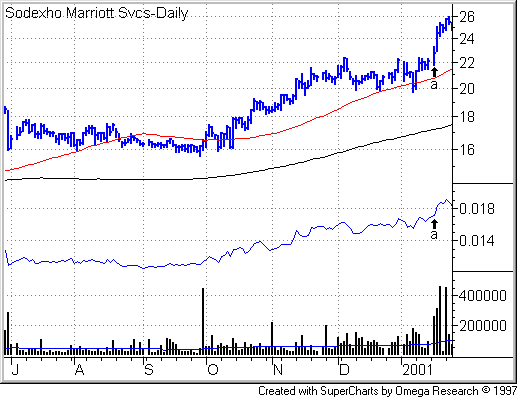
The most important feature of this
stock is the intermediate-term price uptrend, displayed in the daily price bars
rising above the rising 200-day moving average. The rising relative strength
line confirms the strength in the price performance. Then in early December 1999
the stock corrects, bottoms, tries to recover and makes a lower low in January.
Notice how the relative strength line made a higher low than the low formed in
the December sell-off. That’s a positive sign of strength.
The stock broke out and printed a new
high on Jan. 16, 2001 on powerful volume (see Point a
in the above chart). Notice that the move was confirmed by the RS line, which
also forged into new high ground.
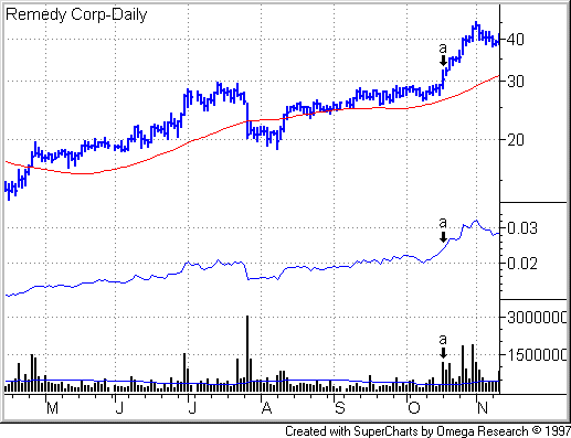
For another example, see the Remedy
(
RMDY |
Quote |
Chart |
News |
PowerRating)
breakout from a consolidation zone on Oct. 18, 1999. Again, you have the primary
requirement: a major price uptrend, followed by correction or consolidation,
then volume and volatility contractions just prior to a breakout a volume spike (see Point
a in the following chart). As you can see, during the long price
uptrend, the stock outperformed the market as indicated by the rising RS line.
Then the RS line punched into new high ground on Oct. 18, validating the
breakout.
 Â Â
 Â
Market
BottomsÂ
Relative strength lines can help you
spot the next crop of leaders around market bottoms. At such turns, you’ll have stocks
that have fought the general downtrend. These stocks try to take off but are
being held back by the adverse climate. If they decline during the bear or
correction, they don’t decline as much. When the market turns, some of these
explode to the upside.Â
Astute traders have known this for decades. In his 1960 autobiography,
Nicolas Darvas wrote: “I tried to
detect those stocks that resisted the decline. I reasoned that if they could
swim against the stream, they were the ones that would advance most rapidly when
the current changed.”Â
A tell-tale sign of such behavior is a
rising relative strength line even as the stock moves sideways in a tightening
consolidation zone or rounds up the right side of a correction-recovery pattern.
At the time I’m writing this (Feb. 8, 2001), the market appears to be
consolidating following the Nasdaq bear. So you can bet that I’m running nightly
and weekly screens of stocks with high RS percentile scores, then manually
eyeballing the charts for consolidating price action and rising RS lines. When
you see this phenomenon multiply across large numbers of stocks, chances are,
the market has completed or at least interrupted its bottoming process long enough for some of the high RS stocks to break out into tradable rallies.
Be aware that sometimes such breakout rallies can begin some months after the end of the trough of the previous bear or correction. The 1990 bear bottomed on
Oct. 11, 1990. It was not until Jan. 15, 1991, the morning after the U.S. armed
forces launched Desert Storm against Iraq, that the high growth, high relative strength
stocks rallied en masse.
Sell Clues
The relative strength line also can
help you time sell decisions. Again, I use the RS line as a clue rather
than signal. (My only mechanical sell signal comes when a stock hits my initial
or trailing stop.) In most cases, discretionary traders use the RS line in
conjunction with other clues to sell. Just as you look for positive confirmation
for buys, watch out for negative divergence for
sells.
To illustrate, I asked James LaCamp,
a canny chartist and Dain Rauscher investment officer, to share a couple RS line
tip-offs from his personal account.Â
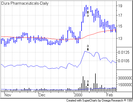
Jim caught an explosive move in Dura
Pharmaceuticals in early January 2000. Although he aims to hold for the medium term, the “highly vertical angle of ascent, more than 45
degrees” had him on his toes to take profits at the slightest hint of
trouble. The stock had shot up over five straight sessions on heavy volume, then
moved sideways for three straight sessions on Jan. 12, 13 and 14. While volume
diminished, trading activity still remained well above par, evidence of churning. Ample buyers were coming to market, but they were being met by heavy
selling.Â
So Jim had two ingredients of a brewing reversal: a
sheer price ascent followed by churning. The RS line provided a third.
While the price closes on Jan. 12, 13 and 14 came with within fractions of
point, the RS line dipped lower. That was enough. Jim sold on the Jan. 14 at 18
3/8 (Point a in the following chart).Â
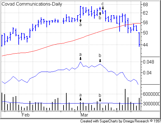
The RS line sent Jim another timely sell clue shortly before the Nasdaq top in 2000. By early March, shares in Covad Communications
Group
(
COVD |
Quote |
Chart |
News |
PowerRating), a broadband service to Internet services providers and
telecos, had doubled in price from its December 1999 lows. On March 1, the stock
printed an all-time high with RS line confirmation (see Point
a in following chart). However, volume was mediocre. The stock came
off a bit over the next few sessions, then rallied on March 10 (see Point
b). Volume declined from the prior session and fell below par as
averaged over the past 50 sessions. Demand appeared to have dried up at this lofty price level. The RS line simultaneously made a
lower high, negative divergence.
If these sound like subtle signals,
you’re right. And you can get stopped out of positions too early if you are
ready to pull the trigger on every sell clue. You’re looking for a culmination
of tip-offs. For Jim, the straw that broke the camel’s back landed on March 13 (Point
c) when the stock gapped down at the open. Jim sold into move,
getting out at 61 5/8. (These prices have been adjusted for a 3-for-2 stock
split on April 3.)Â
Jim trades his personal account for
the intermediate term, but some long-term investors also use trend-following
strategies.
Bob Walsh, whose accounts have an annual turnover rate of 30% to 35% a
year, looks for “the RS line to move up and confirm your longs. Once you’re
in, you want
the RS line to hold up or continue rising. If it diverges to the downside, you
may want to look to lighten up.”
Market Diagnostics
Relative strength lines also make a valuable tool for comparing relative performance of different strategies or categories of stock. The following
chart compares the performance of growth vs. value by dividing the weekly close
of the S&P/BARRA Growth Index
(
$SGX.X |
Quote |
Chart |
News |
PowerRating) by the weekly close of the S&P/BARRA Value Index
(
$SVX.X |
Quote |
Chart |
News |
PowerRating), then plotting that ratio over time. A rising line indicates growth is leading. A falling line line means value has the upper hand. Charts like
this can tell you show where the strategic strength
lies in the market. Add that perspective to group relative strength and stock
relative strength, you can zero in some promising trading opportunities.

RS Lines in
SuperCharts
In Omega SuperCharts, go to Tools, select Quick Editor, select New, put in a name for your indicator, (e.g.,
“RS line”). Once you have entered the name, the Quick Editor will display a new window with five tabs at the top labeled: Formula, Inputs, Styles, Scaling and Properties.Â
Choose Formula if isn’t already the default display. For Plot1 enter the following into the Formula field: input1/input2
This tells the indicator to divide input1 (stock price) by input 2 (index value). Next select the Inputs tab at the top of the Quick Editor window. Type input1 in the Name field, and type “close of data1” (without my quotation marks) into the corresponding Default Value field.Â
In the next line, type input2 in the Name field and “close of data2” (sans quotation marks) in the corresponding Default Value field. Finally, go to style and choose the color that works best with your chart. This can be important. For instance, if you have a black background on your charts, you don’t want a black RS line. Once you choose the color, click OK (saving all your preferences) and close the Quick Editor.Â
At this point, you’ve set up the indicator, but the indicator still needs data upon which to calculate an RS line. If you aren’t already in a Workspace, open one and call up the price chart of a stock. Next, choose Insert (at the top of SuperCharts), then choose Price Data.Â
This will bring up the “Insert Price Data” window. At the top, you will see four tabs: Settings, Style, Scaling and Properties. In the Settings page, go into the drop-down menu and select the directory that contains the index against which you want to plot your stock’s relative strength. Then choose the symbol of your chosen index and click Plot.Â
Now you need to decide whether you want to display the index itself in an additional graph within your chart. I don’t like to do this because
my standard chart already includes graphs of price, volume and relative strength.
Adding another subgraph showing the index makes the chart too busy. I’m just using the index data to calculate an RS line showing the displayed stocks performance vs. the index.Â
Still in the “Insert Price Data” window, click on the Properties tab, then change the Subgraph drop-down menu to “hidden” if you wish to hide the index. If you wish to display the index, don’t go into the Properties page. Instead, click on the Style and Scaling tabs to enter your personal preferences. When you’re done, click OK.
Now you’re ready to insert your relative strength line. Right click somewhere in your chart and select Insert Analysis Techniques. Then click on the Indicator tab at the top of the window if the Indicator page is not already displayed. Scroll down until you see the name of your RS line indicator. Select it, click plot. Click the Style and Properties tabs to make sure those preferences suit your taste. Then click OK.
For The Best Trading
Books, Video Courses and Software To Improve Your Trading