Chart Classics: Reversal And Continuation Patterns
Let’s delve
into a little more detail about five
well-known chart patterns: how they reflect basic price action
principles and what to understand about the trade signals they provide.
At the simplest level, chart patterns
can be divided into reversal patterns and continuation
patterns, and both categories are exactly what they sound like:Â
- Reversal
patterns suggest the culmination of trends and
a change in price direction;Â
- Continuation
patterns imply a resumption of an existing
trend and are usually shorter in duration than reversal patterns.Â
| Chart patterns imply different price developments, depending on their context |
These reversal and continuation patterns
include some of the “classic” chart patterns, such as double tops
and bottoms, head-and-shoulders, triangles, flags and pennants.
Rather than discussing these patterns in detail, we will instead discuss their
characteristics and try to eliminate some of the confusion surrounding them. It
is actually more beneficial not to dwell initially on every idiosyncrasy of
every pattern variation, and instead understand what these patterns represent,
in terms of possible price action. While the names of some chart patterns — and
the implications many traders attribute to them — can seem obscure or esoteric,
the ideas behind them are usually very simple.
The importance of
context
Before discussing specific patterns,
we need to make an important, but often overlooked point: Chart
patterns imply different price developments, depending on their context.
A pattern that occurs in the middle of a choppy trading range may mean something
completely different than a similar pattern that occurs in a trending market.
It’s also necessary to consider the
time frame of a particular pattern to better understand its potential.
Shorter-term patterns (say, a five-day trading range, or flag) generally imply
shorter-term price reactions; longer-term patterns (such as a slowly developing
double top), signal the potential for much more significant price reactions.
| A continuation pattern is a period of price congestion or consolidation that interrupts a trend |
The underlying logic of these patterns
and principles are constant, regardless of the time fame chart you consult.
Pattern examples will be shown on intraday, daily and weekly charts just to
underscore this point.
A reversal pattern like a double top
on a weekly chart implies the same kind of price action it does on a 15-minute
chart, just of a different magnitude: The signal on the weekly chart suggests
the potential for a major trend reversal, while the signal on the 10-minute
chart would imply a reversal of the very short-term (probably intraday) trend.
Continuation patterns
A continuation pattern is a period
of price congestion or consolidation that interrupts a trend,
a concept familiar to anyone who attempts to enter trends on corrections, or
pullbacks. A breakout of the pattern in the direction of the previous trend is
the standard entry signal and represents a resumption — a continuation —
of the trend. The best-known continuation patterns are triangles, pennants and
flags.
1. TrianglesÂ
Figure 1 shows an example of a triangle: a congestion period in which price
swings progressively into a narrower and narrower range, and trendlines drawn to
define the upper and lower boundaries eventually intersect to form a triangle.
Triangles represent a progressive compression of prices (increasingly low
volatility), a condition from which markets often make sharp or dramatic price
moves. (There are a variety of triangle “types” — symmetrical,
ascending, descending–but for now these distinctions are not important; these
variations all share the same principles.)
While triangles also can
act as reversal patterns after long trends, they are more commonly continuation
patterns. A breakout of the triangle in the direction of the trend signals the
trend has resumed, while a breakout through the opposite side of the triangle
would imply the trend is in jeopardy or has reversed.
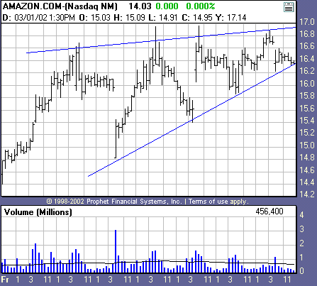
Figure 1. 30-min.
chart of Amazon.com (AMZN) 3/1/02. A convincing breakout to the upside or
downside will be necessary to determine whether this triangle is a pause in an
uptrend initiated by the previous trading range breakout, or a top pattern that
reverses the quick up move.Â
The triangle in Figure
1 developed immediately after a strong upside breakout and
accelerated rally (it’s not surprising the market would “catch its
breath” after such a run-up). A convincing up move out of both the
triangles outlined here (and even better, and move above the relative high that
began the larger triangle) would cast the pattern as a continuation; a solid
move below the low the triangle would make the pattern a reversal.
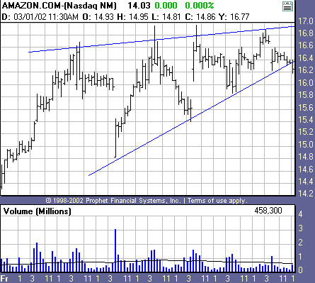
Figure
1a. Update: Amazon.com, 30-minute bar. The triangle pattern broke
down on the next bar. Note that while the triangle boundaries could be
(subjectively) re-drawn as time passed, the fundamental logic of the pattern —
that price is consolidating and poising to break out — remains intact.Â
2.
PennantsÂ
Pennants are essentially shorter-term triangle patterns — less than a month in
length on a daily chart, for example. They are still congestion patterns,
however, and are interpreted the same way as their larger counterparts.
3. FlagsÂ
Like pennants, flags are also shorter-term congestion patterns, but the lines
defining their upper and lower boundaries run parallel instead of converging.
Flag patterns are really
short-term trading ranges; a minimum number of bars
would be 3-5; as is the case for pennants, a flag that extends to approximately
twenty or more bars is more properly classified as a trading range. Flags may
form both diagonally (usually against the direction of the trend, as in a
correction or pullback formation) instead of horizontally. Figures 2 and 3 show
examples of pennants and flags.
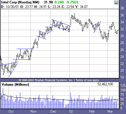
Figure 2.
Daily chart of Intel (INTC). Flags and pennants interrupt trends on this daily
chart and offer short-term support and resistance levels at which to enter
trades and place logical stop-loss orders (at the opposite boundary of the
pattern from which the trade is entered). Â
One interesting aspect of this chart is the congestion pattern
that forms in late
November
in Figure 2. Is it a pennant or triangle? In
a sense, this example shows how subjective chart analysis can be.
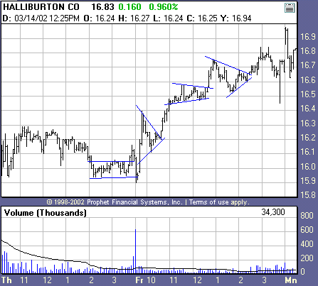
Figure 3. An
intraday
chart of Halliburton (HAL) showing flags and pennants. Â
However, it’s not the name that’s important, it’s what a
pattern suggests the market might do. In this case, a downtrending market is
consolidating in an increasingly narrow range. The astute chartist would not get
hung up on counting the precise number of bars and labeling the pattern, he or
she would be more interested that the pattern was offering the potential to
enter the downtrend on a downside breakout of the pattern, or possibly go long
(or liquidate existing shorts) if price instead broke out of the upside of the
pattern.
Further, chart patterns are rarely contained perfectly inside
the lines defining their upper and lower levels; slight penetrations are the
rule rather than exception, as is clearly illustrated in these examples.
| It’s not a pattern’s name that’s important, it’s what the pattern suggests the market might do |
Continuation patterns imply
indecision in a market; it is during these periods that traders look for new
opportunities to enter an existing trend (or add additional positions) on a
breakout in the direction of the trend or to lighten up or liquidate positions
if the pattern “fails”–that is, resolves against the direction of the
trend.
As these charts make clear, there’s nothing too complex going
on here. All continuation patterns reflect the same kind of market
behavior–congestion. As far as the price action they imply, they are really no
different than trading ranges. When the pattern is resolved, the trend should
resume. If price breaks out of the opposite side of the pattern, it suggests a
disruption in the trend. The tighter and longer the congestion pattern, the
greater the chances of a forceful move out of the pattern.
Effective risk control Â
Notice in all these examples, the patterns offer clear entry points and stop
levels. Chart pattern boundaries allow you to place logical, market-based stops
that take you out of trades when the price action suggests the market’s outlook
has changed. (This will hold true for the reversal patterns we discuss in the
next section as well.)
For example, if entering a long trade on the upside breakout
of a flag, the bottom of the flag (in practice, somewhat below it) makes a
perfect stop level: If the market reverses and trades below this level, it
suggests the outlook and dynamics that justified the original long trade are not
longer valid. If that’s the case, common sense dictates it’s time to get out of
the trade–or take one in the opposite direction if the evidence is there to
support the decision.
| Seasoned traders go with what the market is telling them now, rather than brooding on what it was telling them five days ago |
Having the flexibility to trade such
failed signals is one of the hallmarks of seasoned traders. They know to
go with what the market is telling them now, rather than brooding on what it was
telling them five days ago. A
failed flag breaks
out but then immediately reverses back into the trading range. An
alert trader would recognize this as a sign that there is no momentum in the
breakout and would either liquidate or lighten existing positions and choose to
go long or short depending on the direction of the failure.
Also, in the case of very narrow continuation patterns, the
small risk makes it easier to take a second shot at a trade signal if stopped
out the first time. Again using a hypothetical flag example, if the market
reversed to just below the lower range of the flag (stopping you out), you could
re-enter on another move above the upper range of the flag if the market
reversed again to the upside with nothing much lost. Figure
2
shows two especially short, narrow flags that would have offered low-risk
opportunities.
Reversal patterns
Reversal patterns occur at the tops and bottoms of markets and
imply a change in direction of the major trend. Most of them are really
specialized versions of support and resistance principles. Using such patterns
involves recognizing them as they are developing, and finding logical entry
points and stop levels.
4. Double tops and bottoms Â
For example, the double top pattern pictured in Figure
4 reflects the idea that if a market makes a new high, corrects,
advances again toward the previous high, and then falls again, it has failed to
break through the resistance implied by the first high, and a reversal is
likely. Obviously, such a signal would be more meaningful after a long uptrend,
as in this example. The situation would be reversed for a double bottom. Triple
tops are the same concept except that, not surprisingly, one more high (or low)
is involved.
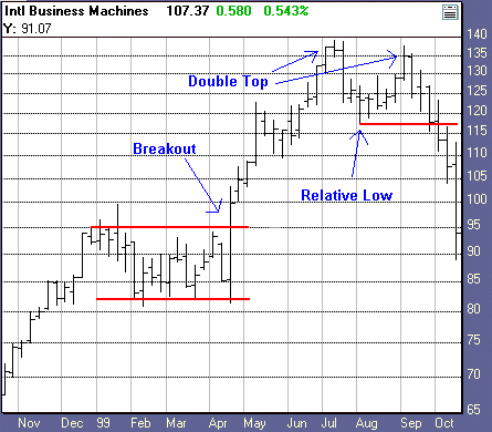
Figure 4. Weekly
chart of IBM. Penetration of relative low between the peaks of the double top
marks a logical downside entry point (or liquidation point for existing longs);
a stop would be placed above the high of the pattern
— the same spot at which a breakout trader would go long on the resumption of
the major trend.Â
A logical point to enter trades on double tops or
bottoms is on a move below the relative low between the two peaks of a double
top, or above the relative high separating the two troughs of a double bottom.
The relative lows and highs represent shorter-term (secondary) support and
resistance, that when violated, confirm price reversals. Conversely, stops can
be placed above the high of a double or triple top, or below the low of a double
or triple low. A surge past the high of a double top or below the low of a
double top negates the original premise of the pattern, so such levels are
prudent choices both for stops and for trade entries based on the failure of the
original reversal pattern.
5. Head-and-shouldersÂ
The head-and-shoulders pattern is really just a more complex version of the
double and triple top price behavior discussed in the previous section.Â
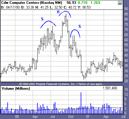
Figure 5.
Weekly chart of CDW Computer Centers (CDWC). “H” marks the head and
“S” marks the shoulders of this nearly textbook head-and-shoulders
pattern.
Figure 5
shows a head-and-shoulders pattern forming. Note that the pattern would be much
less significant, had it occurred in the middle of a choppy, trading-range
period, or after only a small rally. In this case, the pattern’s appearance
after an extended uptrend makes it especially worthy of consideration.
Common Characteristics
What do these reversal patterns have
in common? They represent declining market momentum, assuming we are only
considering patterns that form after established trends.
Again, this is only common sense. All
trends must end. The longer a market trends, the closer it is to its eventual
reversal. When a market enters a congestion period and/or hits resistance
overhead or support below after a long trend (which is a good working definition
of a reversal pattern) it is only natural to consider the possibility the market
may reverse. As was the case with the continuation patterns in the earlier
section, the boundaries of reversal patterns offer clearly defined entry
and stop levels.
Being practical about
chart patterns
As we’ve pointed out, one good thing about simple chart
patterns is that it’s easy to tell when things go wrong: If the market goes in
the opposite direction implied by a chart pattern, you know you should get
out–or reverse your position. And as we’ve illustrated, it’s easy to find
logical levels at which to place your stops: slightly above or below the
opposite side of the pattern.
Of course, because common-sense stop levels are so easy to
determine, you also run the risk of having your stop triggered (with all the
other traders who have placed their stops at the same level) when floor traders
and other pros go “stop hunting”–pushing prices up or down to areas
they think stop orders are clustered to take advantage of the quick price burst
that occurs when many stops are triggered at once.
| Not every wiggle on a chart is significant; all charts contain a great deal of “noise” |
Also remember that every wiggle on a
chart is not necessarily significant–there’s a great deal of meaningless
fluctuation — noise — on any chart. Unfortunately, a valid criticism of chart
analysis is that it’s too subjective — that is, patterns are in the eye of
the beholder. This complaint is absolutely true. It is difficult to test trading
strategies based on many of the patterns described here, and some traders never
feel comfortable with techniques that do not submit to rigid mathematical
definition.
The only way to improve chart analysis is through experience
and by applying a little common sense when interpreting patterns. Remember, the
context of a particular pattern is just as important as the pattern itself.
Something that looks like a pennant in the middle of a trading range is not
significant; the same pattern in the middle of a trend, is.
Confirming trade
signals
Chart patterns are not magic signals, they’re simply price
developments that suggest the possibility of certain kinds of market behavior —
e.g., trend continuation or trend reversal — and are based on the simple
concepts of support and resistance.
Successful chart-based trading requires knowing when to get
out of a trade that isn’t working by using stop orders placed at levels
representing the failure of a pattern — a sign the market’s character and
outlook has changed — and confirming trade signals when they occur with other
patterns or filters that support taking the trade (such as going short only
after two closes below the relative low between the two peaks of a double top).
While we’ve only touched on the types of chart patterns, the
basic principles of interpreting and trading different varieties remain
constant. The most important thing to remember about chart patterns is that they
all revolve around either trend, price congestion or price extremes — all very
simple concepts. It’s not necessary — and certainly not advisable — to make
trading more complex than it has to be.
