How I Gauge Market Direction By Watching Individual Stocks
Traders first learn to use chart
patterns to time buy and sell decisions on individual stocks. But don’t miss the
forest for the trees. The time you spend combing the charts for trades also can
furnish you with an invaluable gauge of the overall market.
Pattern formations don’t just crop up
in individual stocks. They also proliferate among groups of stocks and at key
turning points in the general market. Cup-with-handle bases, rare near the end
of extended rallies, come out of woodwork at market bottoms. Bearish
distribution and patterns such as head-and-shoulders tops and climax sell-offs
often precede market tops.
To spot such turning points, you must
be able to do more than recognize different patterns. You must have a memory
for their absence or scarcity prior to their proliferation. So when a pattern
multiplies across many individual stocks, you’ll detect the change. At minimum,
this requires that you scan hundreds of stocks at least once a week. Many
professional traders set aside Sunday evening to perform this research.
While that may sound like a tall
order, databases and other research products can help you accomplish this task
in several hours.
As an intermediate-term momentum
trader, I break down my weekly market survey into two parts.
First, I use TradingMarkets’
to generate a list of all stocks with a one-year relative strength score of 90
or higher. Stocks also must have last closed at 15 a share or high. This is
“my market” — the waters that I prefer to fish in. It also enables me
to track the market leadership as high RS stocks are, by definition, leaders.
Then I comb through the list, eyeballing each individual chart, eliminating
those issues which fail to meet my other selection criteria.
Of course, I could generate a more
refined list by instructing the program to screen for more variables than price
and relative strength. This would enable me to spot potential trades in far less
time. But it would defeat my ability to get a handle on the composition
(industries, market cap, etc.) and character (bullish, bearish) of the market
leadership.
I scan the entire list, making a
mental note of the industries and sectors that appear in greatest numbers on the
list. I also glance at the shorter-term relative strength scores to get a
general sense of which areas of the market are retaining leadership and which
may be giving way. Then I dive into the individual charts.
It’s just as important for me to know when
leadership stocks with are not forming sound bases as
when they are recovering or breaking out. I want to know if the leaders are
forming the right sides of correction-recovery patterns, tightening in
bases, reversing off bottoms, being accumulated
in sell-offs, becoming increasingly extended, failing
on breakouts, churning near their highs or showing other signs of
distribution, trading wide and loose, etc., etc.
No single indicator will give you this
depth of insight into the fabric of the market. You must eyeball the charts of
hundreds of leadership stocks every week. If stocks sell off or break out en
masse, everyone will notice it. By then, it’s too late. You want to see things
coming. And that requires a perspective that comes from peering into the charts
of the leaders on a regular basis.
As I flip through the charts of my
listed stocks, I watch for recurring themes. For instance, perhaps the right-side
recoveries in a given week are looking more V-shaped (and thus prone to failure)
than U-shaped. Maybe I’ll notice churning near the highs in a large number of
stocks of a particular industry group.
Once I’ve gone through the chart of
every listed stock, I have a good handle on the leaders. And I’ve refreshed my
list of target stocks for real-time tracking throughout the week. I know the
state of my market.
Next, I take a step back and check out
the internals of the general market. I probably won’t trade the sub-90 RS names,
but I still don’t want to overlook promising base builders that fall outside my
RS criteria. If the base looks particularly sound, and the stock shows signs of a
relative strength turnaround in the near term, I may still be interested.
For this check, I go to the Stocks
Building A Base screen and again eyeball the individual stocks. For
more on how to use this TradingMarkets indicator, read Kevin Marder’s lesson
How To Use The TradingMarkets.com “Stocks Building a Base” Screen.
When the market is bottoming after a correction, scads of high RS stocks will complete sound bases. That’s a valuable sign of a nascent rally.
Combining this analysis of the market’s microstructure with a proven macro
indicator or signal, like the follow-through day, can significantly improve
your odds of entering the market at the right moment in time.
As a rally ages, fewer and fewer high RS stocks will be in sound bases. They will become further and further extended. The leaders continue to extend, without new leaders coming up from behind out of sound bases.
This tells me that a rally is growing long in the tooth. If this occurs, I’d
definitely throttle back on margin if I were on margin, and I’d look for
opportunities to take partial profits.
These are extremely useful signals, especially given the fact that high RS stocks lead the
market. So they can change direction ahead of the major averages.
Be alert to concentrated pattern
formation and price moves in specific industry groups. Biotechs, for instance,
came out strong as a group in June-July 1999. Semiconductors weakened and came
under distribution in August-October 1997.
Let’s look at a few examples. (Note:
The following charts are priced to reflected subsequent stock splits.)
Biotech Breakouts
Invitrogen
(
IVGN |
Quote |
Chart |
News |
PowerRating) broke out of
two consolidation zones in June 1999. The company, which came public in February
of that year, is a picks-and-shovels business. It sells cloning kits used by
researchers for genomics companies and other biotech ventures to make DNA
cloning samples.
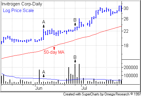
The stock popped out of a narrow-consolidation zone on June 7 on low volume, then began digesting its gains in a
tightening trading range (see Point A). If
you prefer to buy on breakouts when volume expands with price, you would have
missed this move. However, the advance, if you had spotted it, could have
alerted to you something stirring the stock, especially given the constructive
trading action among other biotechs. When the stock cleared the second, higher
range on June 28 (Point B), it did so on a
powerful expansion on June 28.
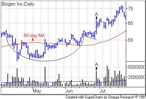
On June
29, Biogen
(
BGEN |
Quote |
Chart |
News |
PowerRating) broke out of a 12-week cup-with-handle base on heavy
volume (see Point A in
the following chart).
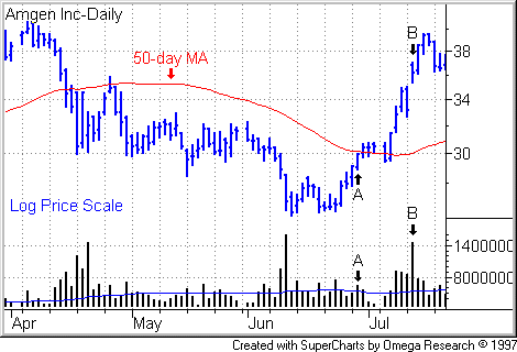
Amgen
(
AMGN |
Quote |
Chart |
News |
PowerRating) posed a more
difficult challenge in terms of finding an entry point, but the
correction-recovery pattern was clearly etched in the chart. I’ve indicated the
stock’s trading action on June 29, 1999 (Point A)
just to give you common time reference points with Biogen. Those with a real
stomach for volatility could have caught the breakout on July 13 (Point
B).
Semiconductor Breakdown
Semiconductors, market leaders in
1997, began breaking down as a group ahead of the Black Monday sell-off on Oct.
27 of that year.
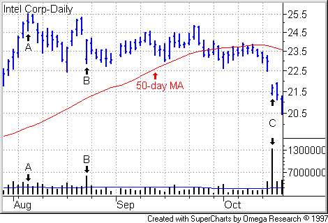
Intel
(
INTC |
Quote |
Chart |
News |
PowerRating) peaked on Aug. 6,
1997 (Point A), tried to rally back on light
volume but fell short, then sold off the next session on Aug. 22 (Point
B) on heavy volume. There still was ambiguity. The stock closed near
the high to the day’s high. Big gap down on Oct. 15 (Point
C).
Applied Materials
(
AMAT |
Quote |
Chart |
News |
PowerRating) peaked
on Aug. 20, 1997 on mediocre volume (Point A).
The stock headed lower over the next two sessions, gapping down on double normal
volume on Aug. 22 (Point B). From there,
notice the dry-up in volume, followed by heavy distribution on Oct. 16 (Point
C).
