The Technician’s Basic Tool: The Price Chart
Whether you
trade short-term or long-term, discretionary or systematic, your goal
as a technician is always the same: to find profitable patterns in price
behavior. To accomplish this,
technicians use a number of methods to identify the prevailing price trend, or
to identify points at which a trend is about to reverse (the time scale, of
course, can vary). These basis for these techniques can be roughly divided in
two categories: chart analysis and technical indicators.
Because basic chart analysis is the
backbone of technical trading, we’ll explain the most popular chart types, what
they tell you, and where chart analysis fits into an overall trading plan. In
future articles, we’ll go into more detail about specific chart pattern and
trend analysis.
Elements of a price
chart
Price charts can depict price action in
any number of time frames or styles. In almost all cases, though, the horizontal
x-axis of the chart represents time and the vertical y-axis represents price.
Before discussing the different types of charts, though, there are a few simple,
but important concepts you need to understand.
- High. The
highest price of a given trading period, be it an hour, day, week, or month.
- Low.
The lowest price of a given trading period.
- Opening
price (or open). The price at the beginning of a trading period
(usually a day). For stocks, the open is the price of the first trade that
is recorded after the market opens; for futures, the opening price
represents the average price (approximately) of the first minute of the
trading session.
- Closing
price (or close). The last price of the trading session (for
stocks) or the representative trading price of the last minute of the
trading session for futures. The closing price takes on special importance
because it functions as a representative price for a particular trading
session–the price the market arrived at after a day of trading. The closing
price is the most commonly used in technical indicator calculations.
- Range.
The difference between two specific price levels, most commonly the high and
low of a given period. For example, the daily range is the difference
between the high and low prices of the day, the weekly range is the
difference between the high and low prices of the week, etc.
- Volume.
The number of shares or contracts traded in a particular market in a given
time period (usually day).
- Open
interest. The number of open trades in a particular market. Both
volume and open interest provide measures of liquidity, i.e., the
amount of trading activity in a market, and thereby the ease with which you
can get in and out of it. Liquid markets are generally less risky and easier
to trade than illiquid markets because they are less prone to wild swings or
gaps between prices. (However, some traders use strategies specifically
designed to profit from the volatility in illiquid markets.)
The bar chart
The most popular type of price chart is
the daily bar chart, which summarizes the price action of a trading session as a
vertical line, or bar, ranging from the high price to the low price. The closing
price appears as a horizontal hash mark extending out from the right of the bar
and the opening price appears as a horizontal hash mark extending out from the
left of the bar (sometimes the opening price is omitted).
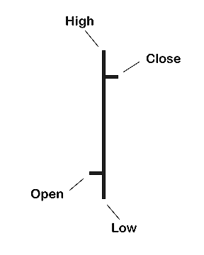
Figure
1. A price bar from a daily bar chart.
Figure 1
depicts a typical price bar. A daily bar chart, for example, would represent
each day’s trading with an individual bar: The high of the bar would be the high
price of the day, the low of the bar would be the low price of day, and the left
and right hash marks would be the opening and closing prices of the day,
respectively. The price bar succinctly summarizes the day’s trading activity:
the daily range (from high to low), where the market opened, and where it
closed. Figure 2 shows a daily bar chart for
Dell computer.
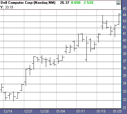
Figure
2. Daily bar chart, Dell Computer.
Time frames
Price charts can be constructed in
virtually any time frame: minutes, hours, days, weeks, months, quarters, years,
etc. A weekly bar chart, for example, would be constructed exactly the same as
the daily bar chart except that it would use the high and low prices of the week
rather than the high and low prices of a day.
The opening and closing prices for a
weekly chart are simply the opening price for the first trading day of the week
(usually Monday, unless there is a holiday) and the closing price of the last
day of the week (usually Friday, unless there is a holiday).
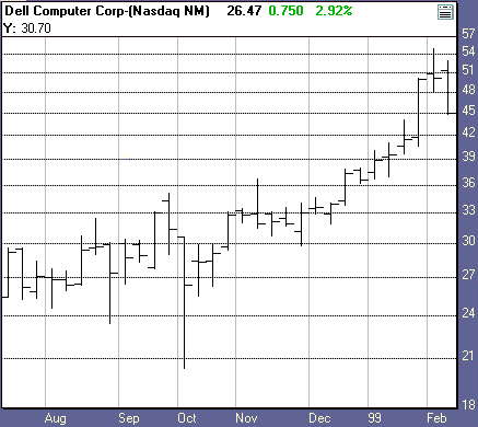
Figure
3. Weekly bar chart, Dell Computer.
Similarly, each bar on a monthly bar
chart would use the opening price of the first day of the trading month and the
closing price of the last day of the trading month. Figure
3 shows a weekly bar chart that also encompasses the time period
captured in the daily chart shown in Figure 2.
Figure 4 shows a monthly bar chart for the
same stock.
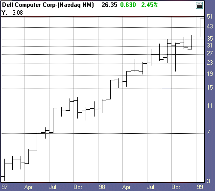
Figure
4. Monthly bar chart, Dell Computer.
An hourly chart, by comparison, uses
the high and low prices of each hour of a trading session to define price bars,
and a five-minute chart uses the high and low prices of each five-minute period.
For such intraday charts, opening and closing prices are often omitted (since,
obviously, there are no official opens or closes reported), or the first
recorded price of a particular period might be used as the opening price and the
last recorded price of the period as the closing price. Figure
5 shows a five-minute chart.
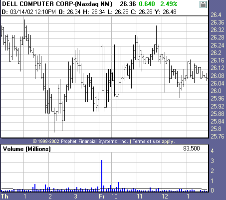
Figure
5. Dell Computer, intraday bar chart. Note: Bars are tightly compressed.
The smallest time frame chart that can
be constructed is a tick chart, which creates a data point for every trade
reported in a market. (Tick refers to the minimum price move in any market.)
Looking at price charts of varying time
frames allows you to focus on as short or long a time period as you want.
Longer-term price charts also enable you to provide a context for the price
action on shorter-term charts. A trade signal generated from a pattern on a
short-term chart may be supported or negated by the activity on the long-term
chart. A short-term buy signal might be ignored, for example, if the long-term
chart shows a strong downtrend is in force.
Other types of
charts
Bar charts are the most widely used
chart type, but they are not your only choice as a technician. Other chart
styles give you different perspectives on price action.
Line (close-only)
charts
The line chart plots only the closing
prices from each trading session, essentially creating a simplified version of
the standard bar chart. Figure 6 shows a
close-only version of the price data from Figure 2.
Some charting software will allow you to create line charts using the high
price, low price, or average price from a particular bar instead of the closing
price, but the closing price is most commonly used in technical analysis.
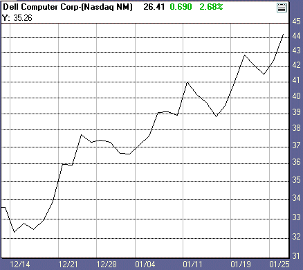
Figure
6. Line chart, Dell Computer.
Candlestick
charts
Candlestick charts, which originated in
Japan, are very similar to bar charts, although they pre-date them by a number
of years.
Instead of a bar for each day (or week
or month, etc.), the candlestick chart uses rectangles that range from the
opening price to the closing price of each trading session. The rectangle is
dark (usually black) if the closing price is lower than the opening price (a
down day), or light (usually white) if the close is higher than the open (an up
day).
The high and low price extremes extend
as vertical lines above or below these rectangles, forming “wicks” to
the bodies of the candles represented by the rectangles. Of course, if the high
and low of the day are identical to the open and close, no wicks will exist;
conversely, if the open and close are the same price, no rectangle (body) will
exist. Like bar charts, candlestick charts can be constructed on any time frame.
Figure 7 shows the candlestick version of
the price data from Figure 2.
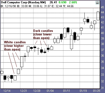
Figure
7. Daily candlestick chart, Dell Computer.
Some technicians feel candlestick
charts highlight certain price patterns standard bar charts do not. There are
numerous elaborately named candlestick patterns, ranging from one
“candle” to several, which supposedly portend price reversals or trend
continuations depending on their context. (Most tests of such patterns, however,
show little success in the way of systematic application.)
There are also several candlestick
chart variations, like renko and kagi charts, but an in-depth discussion of
these charts and their interpretation is outside the scope of this article.
Because candlestick charts use exactly the same price data in exactly the same
time frame as a corresponding bar chart, the preference for one chart over
another can only be considered a matter of taste.
Volume and open
interest
Many price charts includes figures that
track how many stock shares or futures contracts have traded during a certain
time period (volume) and how many open positions exist in a market (open
interest). Because volume and open interest can only be calculated after the end
of trading, these figures are usually released one day after the day they
represent, i.e., Wednesday’s volume is not published by the exchange until
Thursday.
Volume and open interest indicate how
liquid a market is–how much trader interest and activity exists. High volume
and open interest accompany active, healthy markets, and some traders look for
high or rising volume and open interest to confirm trends and other price moves.
Volume and open interest often are
plotted at the bottom of price charts as a line (for volume) and a histogram
(for open interest). Figure 8 shows a daily
chart with volume and open interest included at the bottom.
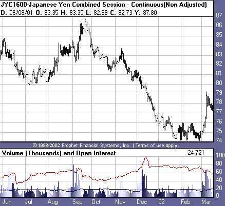
Figure
8. Daily bar chart with volume and open interest, continuous Japanese yen
futures.
What charts tell you
Regardless of what type you use, all
price charts communicate the same information: where prices have been, a clear
picture of market trends, significant historical high and low prices, and an
idea of the volatility in a market. Such information can suggest both what kind
of trading approach might be appropriate and which markets may be suitable for
trading.
The most basic form of technical
analysis involves identifying specific price patterns (longer-term top and
bottom formations like head-and-shoulders patterns, or continuation patterns
like triangles and flags, etc., as well as one-day patterns like spikes and
gaps) and exploiting their probabilities.
Basically, charts allow you to identify
trends and inflection points. Chart analysis is a visually based, subjective
skill that nonetheless can yield excellent results when approached
realistically, and offers an alternative to mechanical, indicator-based
techniques.
Finally, historical charts and price
data allow you to test your ideas before you actually trade them. Luckily,
computers and the Internet give you a great deal of power and flexibility in
researching and analyzing charts and price data.
Copyright
TradingMarkets.com. Any reproduction of this article or any information on this
site without the express written permission from TradingMarkets.com is
forbidden.