WYSIWYG
The markets evolve through
many conflicting versions of technical reality. The version you choose will determine your trading strategy, risk approach and point of execution. It really doesn’t matter which path you walk, as long as you remember one thing: What You See Is What You Get.
Price charts have a lot in common with three-dimensional chessboards. Traders must first deal with their own level playing
field and then anticipate unexpected moves coming from above and below. Fortunately, this is not quite as difficult as it first appears. Start by learning the ways that technical analysis creates friction and conflict. Then build trading tactics to manage this disagreement when it arises.
One common example of this underlying conflict lies in the arithmetic vs. logarithmic chart view. It’s late at night. You suddenly notice that price has broken through a long-term down trendline on your favorite index chart. You run to the stock boards to proclaim the news, hoping to be recognized for your great discovery. But rather than receiving accolades from the adoring crowd, they start screaming because THEIR trendlines are just sitting there, refusing to jump the hoop of overhead resistance. A great technical debate erupts. After a few flames and some nasty name-calling, everyone discovers the truth. The logarithmic traders have no breakout to look at.
Let’s clarify an important point before peeking at some examples. It doesn’t matter which version of reality you look at or trade with. What does matter is that you apply a consistent analysis through all of your decision making. How do you do that? Novice traders can start by learning the ways that technical analysis produces conflicting information, and avoid positions until everything lines up perfectly. Seasoned traders can take the next step and build effective strategies that adapt to conflicting information.
Let’s bring this discussion down to earth with the current market action. Our big rally on Wednesday evoked generous comments from all of the usual suspects, including those at my web site, Hard Right Edge. But did anything really happen that day other than a major Dow breakout? The jury is still out.
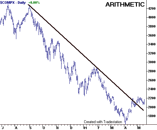
Is the Nasdaq still in a downtrend? Traders looking at the arithmetic chart above would conclude that the downtrend ended in late April when price gapped above that long trendline begun at the September 2000 high. In this chart, last week’s decline looks like a pullback to the broken trendline and a good buying opportunity. But even with Wednesday’s dramatic move, there is little argument that the Composite is still caught within a well-defined range between 2000 and 2200.
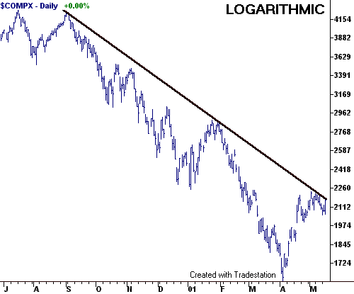
Logarithmic traders see a very different picture of Nasdaq. This technical view draws price bars based on percentage, instead of dollar growth. As it turns out, the Nasdaq shows no break of the down trendline on its logarithmic chart. In fact, Wednesday’s rally pushed price right up to strong resistance formed by three prior strikes of the formidable barrier.
Perhaps you should wait a little longer to call your broker with that big buy order.
Another example of conflict brings WYSIWYG much closer to home. It reflects market comments made last evening by the undersigned, and TradingMarkets resident master swing trader, Dave Landry. But before heated debate breaks out on the stock boards, realize that neither view is right or wrong. They just present alternative ways of looking at the same price chart.
Dave noted in his comments that the “S&P also put in an impressive performance; it cleared the top of its recent range decisively.” But I committed to a conflicting point of view in my public notes at Hard Right Edge, where I wrote the “S&P 500 moved to the top of its trading range.”
It’s enough to make a grown trader cry. How can two analysts have such conflicting points of view on the same price action? There’s a simple answer. We are looking at different versions of the same reality.
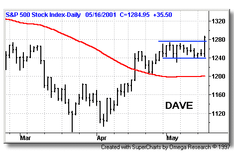

Support-resistance is a deceptively simple concept that leads to many conflicting opinions. That’s the nature of the trading game. Dave uses two horizontal, parallel lines to illustrate the S&P 500 breakout that he sees. Alan uses a rising parallel price channel to illustrate the range that he sees. This underlying conflict actually presents vital information on the current trading conditions. So how do you apply it? Start by avoiding the tendency to adopt one point of view and dismissing the other as invalid. Instead, try to incorporate both pieces of information into your active trading plan.
The S&P 500 index will eventually respond to both realities (and many others that we missed last night). This contributes to many of the unanticipated waves, pullbacks and whipsaws that undermine our trading profits. But common sense dictates that we act when the odds move in our favor. So go ahead and buy Dave’s breakout if you find a good opportunity. But then get defensive at Alan’s resistance if the market hesitates or reverses.
Many traders get frustrated because they unconsciously seek a boilerplate of information that will work well in all market conditions. But the trading gods are never so kind. At any given time, a rally may respond better to a log trendline than an arithmetic one (or vice-versa). And just when you least expect it, a selloff may cut through well-defined support and head straight for a forgotten gap.
The trader’s challenge is to see all that reality has to offer, and then build a risk-management plan to deal with it effectively.
Gary
Kaltbaum on TradingMarketsWorld! Gary Kaltbaum will be appearing on the
Intermediate-Term Trading board today, Thursday, May 17 at 8:00 ET. Be sure to take
this opportunity to chat with and have your questions answered by a leading
intermediate-term trader. Click
here to take your trading to a new dimension.