How to interpret the McClellan Summation Index
This week, I was asked if I had an opinion about
the reverse Head & Shoulders pattern on the McClellan Summation Index.
I would urge everyone to avoid the use of that terminology when describing
McClellan Oscillator and McClellan Summation Index structures. The reason is
that association with that named chart formation implies interpretations which
are not valid.
A Head and Shoulders pattern on a price chart has certain specific rules for
qualification, and also specific expectations based upon it once the structure
does qualify. Those do not apply elsewhere, so it can get confusing to use those
names. For example, the neckline on a price chart is under no obligation to ever
get broken, whereas the return to neutral by the Summation Index mandates an eventual crossing of what would be
the equivalent of a neckline drawn on the Summation Index structures. If an
event is inevitable under all circumstances, then seeing that event take place
does not give us much interpretive value. I can understand what you mean in
referring to them by those names, in order to identify the “terrain features” and talk about them, but I hope you get
my meaning that the rules for H&S structures on price charts just do not apply.
With that out of the way, I can say that having the Summation Index moving
upward is definitely better for the bullish case than having it move downward.
Of greater importance to the interpretation of the market is the fact that the
Summation Index did not get down far enough in June to mark a bear market
bottom. Since we are currently in the 2nd year of a presidential term, that task remains on the market’s to-do list,
probably for October-November.
The chart below of the Ratio-Adjusted Summation Index (RASI) provides a few
points for discussion and interpretation. The Ratio Adjusted version adds a step
to the calculation process, dividing the A-D difference by Advances plus
Declines, and then multiplying the result by 1000 to get it back into the realm
of real numbers. In effect, we are mathematically pretending that there are always exactly 1000 stocks trading. As
such, it is better for multi-year comparisons.
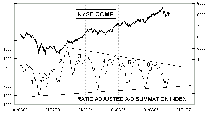
One of the most noticeable points is that the amplitudes have been decreasing
over the past four years. Each successive up wave seems to occur on lower
energy. There has still been enough impulse energy to get the RASI up above the
important +500 threshold on each of the upward waves since 2003, but that is
coming more into doubt as that declining tops line gets lower and lower. A
failure to reach +500 is a sign that the bulls don’t have the energy to achieve
escape velocity. The circled example at the left end of the chart shows such a
failure.
The other big point worth illustrating has to do with the smoothness or
bumpiness of the RASI, since that conveys a lot of information. Smooth moves
imply strength for the direction in which they unfold. It can be bullish
strength, or bearish strength. Point 1 on this chart shows a smooth move
downward in the summer of 2002, when the bears were clearly very strong, and it
took all the way into early 2003 for that strength to be dissipated. Coming off
of the March 2003 market bottom, we saw Point 2 as a very smooth upward move by
the RASI, telling us that the bulls were now strong. The very high RASI reading
on that up wave also conveyed a message of bullish strength for a long time to
come.
But at Point 3, the bulls’ strength was not as good, as the RASI made a bumpy
advance. What followed was a consolidative market in 2004, with the bulls not
finding their strength again until after the RASI had fallen all the way to -765
in May 2004. Point 4 showed another bumpy advance, which implies weakness for
the bulls, but it also was a pretty high move upward by the RASI which
contradicts that weakness message. Prices moved upward, but not by as much as we
saw back in the up moves of 2003.
The latest two up moves at points 5 and 6 have been very smooth up, and bumpy
down, implying that the bulls still had the power and the bears did not. We saw
nice price moves on those smooth RASI up moves despite the diminishing
amplitudes of the RASI peaks.
Now we are in a more questionable time. If the RASI is going to make a bumpy up
move on this current up move, as it so far seems to be doing, that will convey
the message that the bulls’ strength is finally waning, and the bears will be
offered an opportunity to try to have their fun. One bump is not enough to make
a full interpretation off of.
The other trait to look for is how high the RASI gets this summer. I suspect
that we will not see the RASI be able to reach the +500 threshold this time, and
that such a failure will confirm the weakness of this rally and the beginning of
the decline into the 4-year cycle bottom due this fall. The rising bottoms line
on the RASI ought to get penetrated on such a decline.
The one caveat to that point is that so far, the bears are not showing that they
have the strength to pull it off. RASI decline from the January RASI peak has
been about as bumpy as it can possibly be, implying weakness among the bears.
That bears’ weakness condition can change, but for now it is the default
interpretation.
Tom McClellan
Tom McClellan is the Editor of
The McClellan Market Report, an 8-page report covering the stock, bond, and
gold markets, which is published twice a month and the Daily Edition of the
newsletter. Subscribers range from individual investors to professional fund
managers. Tom is a graduate of the U.S. Military Academy at West Point where he
studied aerospace engineering, and he served as an Army helicopter pilot for 11
years.
In June 2006, Timer Digest ranked The McClellan Market
Report #1 Timer for the past 3 and 12 months, and #2 Timer for the past 6
months. In Timer Digest’s 22nd Annual Review, The McClellan Market Report was
ranked 2005 #1 Bond Timer of the Year, 2005 #2 Stock Market Timer and #1 Gold
Timer over the last 10 years.