How to Use Charts to Make Trading and Investing Decisions, Part 1
Part 1 of 2
In the investment world, such terms as sales and earnings are common. After all, if a company can grow its sales and earnings then it will enjoy increased profits. And the increased profits should make the company’s stock more attractive.
Followers of an investment analysis discipline called “charting” will not disagree. However, a brighter future for a company does not always translate into higher stock prices. How many times has a company released blockbuster earnings only to see its shares begin to fall?
Often times, there is a disconnection between the fundamental definition of value and the perceived value reflected in the stock price. Prices often rise in advance of a news release because investors think they know what that news will be. Analysts also think they know and back that up with all sorts of financial models. But the bottom line is that they issue their buy and sell recommendations based on highly educated guesses.
How can we tell if a good fundamental story is also good news for the stock price? In other words, how can we tell if the perception of value is high or low?
The answer can be found in a simple tool – the chart.
What is a Chart?
A chart is simply a graphic representation of the actions of all investors in the market over a specified period of time. Rather than talk about what is or is not a good value, charts show where investors have put their money where their collective mouths are. And there is no better indication of the health of a stock or the market, as a whole, as real money changing hands.
Charts are not voodoo or tea-leaf reading. When prices are plotted over time, they show how a stock has gotten to where it is today.
For example, if we say a stock is priced at $40 we have no idea whether that is a good buy. But if we view it in a chart and see that it has been rising steadily for the past year and was at $41 last week, we will get an idea that it may be a bargain.
Confused? What if we substitute the price of your house for the price of a stock?
If real estate prices have been rising steadily with no real reason to expect otherwise, as they were in 2004, and we can find one selling for 5% less than its comparable neighbor, wouldn’t we hurry to take advantage of the deal? It’s the same thing and we can see it easily in a chart.
A chart lets us see if the price of a stock is rising over time, as was real estate a few years ago, or falling, as we see real estate doing today. The trend of prices lets us know where we stand as buyers and whether we need to hurry up to buy or take it easy and wait until the market tells us we are near a bottom.
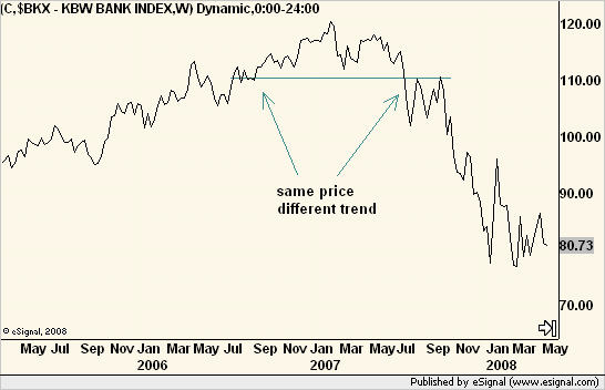
One look at a simple chart of the popular PHLX bank index bears that out. In 2005-2006, buying the dips was a good plan. In 2007, the trend changed and analyst calls for higher price targets were very much different than what the market was saying. Selling rallies was a much better plan.
But there is even more information in charts. By examining the patterns formed by prices, we can assess both the balances of supply and demand and of risk and reward. Charts tell us where investors are likely to sell the shares they own. They tell us where investors are likely to consider prices to be cheap. And they tell us when the collective mood of the market changes.
Clearly, there is a psychological component to all of this. And psychology, or investor perceptions, is the only thing that can explain why any stock does not trade at what everyone might consider to be fair value.
In the markets, perception is reality. Analysts’ assessments of fair value are little more than educated guesses, so wouldn’t it be better to know what the market itself thinks about things instead? After all, saying that a stock is trading above or below fair value, means by definition, that the analyst thinks the market is currently wrong. The market is never wrong.
In the next article, we’ll learn more about using charts to help make investment decisions. No matter how may fancy indicators we throw on it or how deep we crunch the numbers, it all boils down to one of three outcomes: Do we buy it, sell it or hold it?
The market cannot be tamed but what we do about it is well within our control.
Michael Kahn writes the twice-weekly “Getting Technical” column for Barron’s Online and edits the daily Quick Takes Pro newsletter. He is also the author of three books on charting, the most recent being – “Beginners’ Guide to Charting Financial Markets.” Read his blog at www.quicktakespro.com/blog.