Managing Candlestick Trades Successfully
Introduction
You’ve probably heard of “Japanese Candlesticks” before. In the time I revealed them to the Western world they’ve become part of every trader’s vocabulary. Japanese candle chart analysis, so called because the lines resemble candles, has been refined by generations of use in the Far East.
The candle chart phenomenon has caught fire around the world with all kinds of traders, from institutional power players to individual part-timers.
Why do candle charts attract so many traders serious about increasing profits and decreasing risk? Because when you know how to properly use and interpret candle charts, they really work in your favor. They’re reliable. You can count on them.
With the popularity of candles comes misuse. From my public and institutional seminars I have found that a large percentage of those applying candlesticks (even the so called “experts”) are using them either incorrectly or not harnessing their full potential.
This Special Report will detail the two of the most common mistakes traders make with candle charts. But first let’s review how to construct the candle lines and see why candles are the top choice for the world’s most successful traders.
What Are Candlesticks?
Japanese candle chart analysis, so called because the lines resemble candles, have been refined by generations of use in the Far East. These charts are now used internationally by traders, investors and premier financial institutions.
Here are some of the benefits of using candlestick charts:
- Easy to understand: Anyone, from the first-time chartist to the seasoned professional can easily harness the power of candle charts. This is because, as will be shown later, the same data required to draw a bar chart (high, low, open and close) is used for a candle chart.
- Provide earlier indications of market turns: Candle charts can send out reversal signals in a few sessions, rather than the weeks often needed for a bar chart reversal signal. Thus, market turns with candle charts will frequently be in advance of traditional indicators. This will help you to enter and exit the market with better timing.
- Give double the information of bar charts: Candle charts not only show the trend of the move, as does a bar chart, but, unlike bar charts, candle charts also show the force underpinning the move.
- Enhance Western charting analysis: Any Western technical tool you now use can also be used on a candle chart. Candle charts, however, will give you timing and trading benefits not available with bar charts. This merging of Eastern and Western analysis will give you a jump on those who use only traditional Western charting techniques.
- Help you preserve capital: In today’s volatile trading environment, this is of utmost importance.
Now let’s look at how candlestick charts are created with market data:
Constructing The Candlestick Line
The broadest part of the candlestick line is the real body. It represents the range between the session’s open and close.
If the close is lower than the open the real body is black. The real body is white if the close is higher than the open. The real body is white if the close is higher than the open.
The thin lines above and below the real body are called the shadows. The peak of the upper shadow is the high of the session and the bottom of the lower shadow is the low of the session.
The color and length of the real body reveals whether the bulls or the bears are in charge. Note that the candle lines use the same data as a bar chart (the open, high, low and close). Thus, all Western-charting techniques can be integrated with candle chart analysis.
And this will lead us to our first candle mistake:
The Danger of Not Using Trade Management
The use of trade management is one of the major differences between those who have long lasting successful trading careers and those who quickly get blown of the trading waters. Trade management includes risk-reward analysis, protective stops, looking at the overall technical picture and many other aspects that I detail in my more comprehensive educational resources.
One of these trade management items is adapting to changing market conditions. I call this being a “market chameleon.” As a chameleon changes its color according to its surroundings so traders should change their market stance adapting to what the market is telling us. Like the cartoon below there are some slow to adapt:

The most successful traders adapt quickly to the market’s clues. And candles, once you know how to read them correctly, let traders quickly and accurately read the “mood and manner” of the market so they can often get into a trade before other traders jump on the new move. That is the power of the candles – letting you quickly adapt to the clues the markets send out.
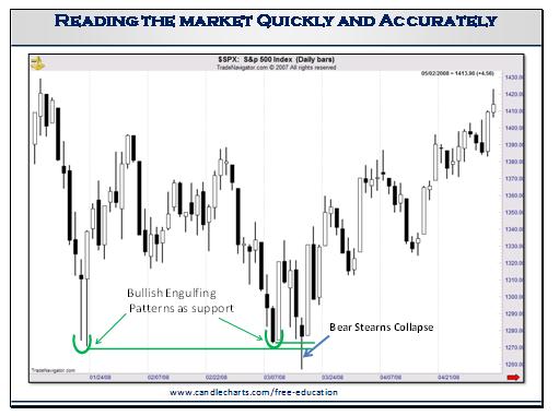
In January there was a classic bullish engulfing pattern. This relatively large white candle compared to the much smaller (almost a doji) black candle graphically reflected the bulls had overwhelmed the bears. Another aspect which underscored the importance of this pattern was the very long bullish shadows. These extended long lower shadows visually displayed a strong rejection of lower prices (isn’t it amazing how much more information we get about who is winning the battle between the bulls and bears with candles than with a bar chart – although they both use the same open, high, low and close data!)
Most of the candle patterns (but not all) can be used as support or resistance. And the lowest low of the two sessions that make up the bullish engulfing pattern is one of those patterns we can use as support (based on a close). And note how the lows of this pattern held at the green arrow in mid March.
Now here’s where being a market chameleon comes into play. On the day of the Bear Stearns collapse the S&P broke under the support of the bullish engulfing pattern – but what happened by the end of that day? Right – the bears couldn’t keep prices under that support. So the market was able to shrug off the extremely bearish news. As Bernard Baruch said “It is not the news itself, but the market’s reaction to the news that’s important.” And this was an important sign of a potential major low since the market both shrugged off very bearish news and held the support, on a close, of the bullish engulfing pattern.
So for anyone who sold on the break under the support during the day of the Bear Stearns news should have adapted their stance by the end of the day to exit because the support at the bullish engulfing pattern held rock solid. And for those flat on that day it was a golden opportunity to buy (using the lows of the Bear Stearns news as a stop) and a target to the top end of the trading range (what the Japanese call a “box” range) near 1400.
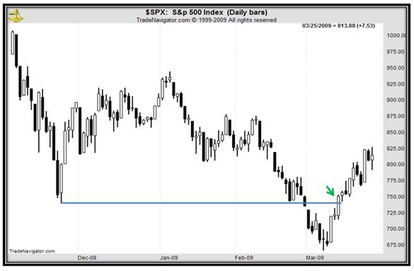
Note: the action has been very similar in the recent S&P shown on the chart below as a previous important support area (the blue line) was breached in early March. But once the bulls pushed the market back over this line, the trend turned positive. We call this our “crack and snap” strategy since the market “cracks” support and then “snaps” back over the broken support. It is one of my favorite strategies. There are great trading strategies you can do this tactic which are beyond the scope of this article.
Steve Nison, CMT is the founder and president of www.candlecharts.com. Steve has the distinction of introducing the previously secret candlestick technique to the Western world. He is also an expert on Western technical analysis with over 30 years of real world experience. He has presented his trading strategies in over 20 countries to traders from almost every investment firm and been a guest speaker at numerous universities as well as the World Bank and the Federal Reserve.


