Today’s Trading Lesson From TradingMarkets
Editor’s Note:
Each night we feature a different lesson from
TM University. I hope you enjoy and
profit from these. E-mail me
if you have any questions.
Brice
My Favorite Warning Signs
of Climax TopsBy Loren Fleckenstein
TradingMarkets.com
You don’t need to be an options trader to
take advantage of extremes in crowd sentiment. The climax run represents a
critical selling stage where the trader can sidestep steep losses and lock
in a rare windfall before a highflier breaks apart.
Climax runs occur in stocks that have already
recorded extended advances into new high ground. By this point,
institutional investors who benefited from the price expansion are ready to
take profits but need heavy demand to sell into. Otherwise, they could
precipitate a share-price collapse before liquidating their positions.
At some point in the advance, a stock will
sharpen its climb. In some cases, the long advance has attracted enough
attention to whip up a buying frenzy among individual investors. The news
media may latch onto the stock or its industry, blowing more air into the
bubble. These late-comers provide the demand liquidity needed by the
institutions to make a clean getaway. At last, the demand bubble exhausts
itself, and the stock plunges back to earth.
During the final run-up in price, a clear
sell signal comes when the stock makes the biggest price advance in the
run-up on the heaviest volume of the run-up. The stock may head higher the
following session, but the reversal is swift in coming.Â
Climax runs stand out plain as day on simple
arithmetic or linear charts. But the prior long-term ascent leading up to
the run-up often appears masked in a linear price chart. So I will
illustrate examples of climax runs using both logarithmic and linear price
scales. The long advance leading up the climax reveals itself most clearly
in a log chart. The climax run stands out best on a linear chart. I’ll use
both charts to illustrate in the following examples.For more on the value of using log vs. linear charts, check out my June 9,
2000,
Trading The News column and my lesson
Using Weekly Charts To Spot Accumulation.
Remember the spring 2000 crash in biotech
stocks earlier this year? On March 14, President Bill Clinton and British
Prime Minister Tony Blair announced that the world should have free access
to the data developed by the publicly funded Human Genome Project. That
triggered a massive sell-off in the sector, particularly among the genomic
stocks. Many of the high-profile genomic names actually underwent climax
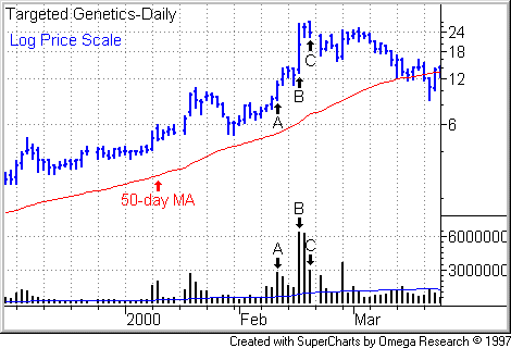
sell-offs the month before.Target Genetics shares (TGEN)
had expanded nearly eightfold in price by Feb. 10, 2000, (see
Point A in the following log chart) from
its Oct. 29, 1999, low. Then the stock caught fire again, advancing rapidly
over the next several sessions.
On Feb. 16, the stock exploded
to an intraday high of 26 3/4, more than double its prior close of 12 9/16.
The stock sputtered and dropped 26% from the session high to close at 19
3/4. Trading activity swelled to 6.3 million shares, by far the heaviest
volume during the stock’s four-month ascent (See
Point B). There’s your sell signal.Note that when the stock opened in new high ground two days later, it
promptly headed lower while volume contracted well below the prior two
sessions (see Point C). The buyers have
left the stage. Demand is insufficient to sustain the stock at these lofty
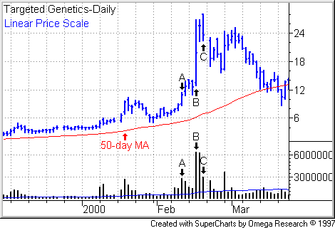
levels.Here’s the same trading history on a linear chart.
Once a stock crashes from a climax top, the road back to new high ground can
be a long one. The stock now is under crushing
overhead supply. Overhead supply is the amount of stock in the
hands of shareholders with paper losses. These weak
holders tend to look for exits and sell into rallies, blunting
further progress when the stock tries to rally.Â
As a result, momentum traders avoid stocks
that are trading well off their 52-week highs. To steer clear of excessive
overhead supply, I insist that recently corrected stocks must exceed their
50- and 200-day moving averages as well as their
mid-levels. You can find a stock’s mid-level by summing the
pre-correction high and the post-correction low, then dividing the result by
2.
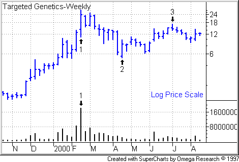
Look at Targeted Genetics on the following
weekly chart. The stock peaked at 28 a share (Point
1) and bottomed at 5 5/16 (Point 2),
putting its mid-level at 16 21/32. The stock managed to surpass that point
briefly in early July 2000 (Point 3)
before succumbing to another bout of selling.
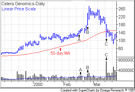
Celera Genomics (CRA),
the leader in the race among companies to identify genes in the human
genome, took one of the heaviest blows when Clinton and Blair spooked the
market on March 14. But as you can see in the following chart, the stock
climaxed more than two weeks before.
Again, let’s take two views of the stock — a
log chart to do justice to the prior advance, an arithmetic chart to capture
the violence of the climax move and subsequent sell-off.
Celera shares broke out of a three-week
consolidation zone on Feb. 16, 2000 (see Point A
in the following log chart). By this time, the stock had expanded more than
nine-fold from its Oct. 18, 1999, low (Point 1).
Obviously, with so great price expansion behind it, anyone in this stock
should have had in place a trailing stop and be eyeballing the stock’s
trading action for signs of distribution or climax action. The stock began
its climax run.
Let’s zoom in for a closer look with a linear
price chart.Â
On Feb. 24, Celera exploded 68 points to
close at 238 on Feb. 24, the biggest price and percentage (40%) gain of the
entire ascent, let alone the more recent run-up. (See
Point B.) Volume was the heaviest of the run-up — in fact,
the heaviest in seven weeks. If you didn’t get out here, you still had a
second chance. After climax runs, stocks sometimes try to head further the
following day, which occurred in Celera’s case on still higher trading
activity.
Look at the pattern itself and take a step
back. After an extended run, the price move has turned parabolic. Even if
you were unfamiliar with the specifics of the climax run, such a steep price
move after an extended advance should raise big doubts about the near-term
sustainability of the stock’s price momentum. If you find yourself divided
over whether to hold or sell, cash in half your position and take partial
profits. Then watch the remaining position like a hawk.
As you can see from the above chart, Celera
reversed to the downside soon afterward and gave up just about all of the
gains from the Feb. 24 climax move the day before Clinton and Blair socked
it to the genomics. (Point C shows the
March 14 sell-off.)Â
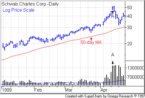
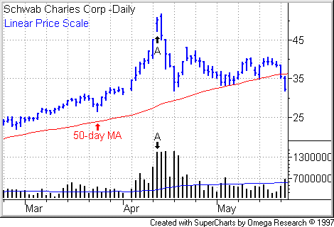
Charles Schwab (SCH)
exhibited a classic climax run on April 1999. The following charts have been
adjusted for subsequent stock splits. By April 12, shares in the discount
broker had expanded 540% from their Oct. 8, 1998 lows.
On April 13, the stock gapped up 11% after a
rapid run-up over the prior five sessions. Volume exploded as institutions
sold into the frenzied demand. The next session, Charles Schwab shares edged
higher, then reversed hard, completing a bearish engulfing pattern. From
there, the stock went into freefall.
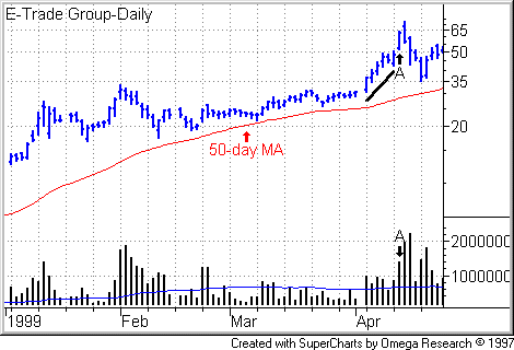
As with the biotechs in 2000,
the Schwab climax run was part of an industry-wide top. You can see the same
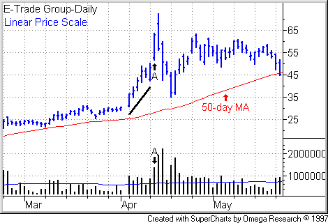
action in E-Trade Group (EGRP),
holding company for the deep-discount online broker.
After an extended advance, E-Trade entered a
sharp run-up (see black line in the following charts), then recorded its
biggest price move on its heaviest volume day of the run-up on April 13,
1999 (see Point A). The stock headed
higher the next session, then reversed, the start of a wicked sell-off.