Today’s Trading Lesson From TradingMarkets
Editor’s Note:Each night we feature a different lesson from
TM University. I hope you enjoy and
profit from these.
E-mail me
if you have any questions.Brice
What Historical Market Patterns Can Teach Us About The PresentBy Daniel Beighley
TradingMarkets.com
Â
“The
study of history,
while it does not endow with prophecy,
may indicate lines of probability.”
–John Steinbeck
Â
This lesson will discuss the bubbles of the Dow
Crash of 1929, the Nikkei Crash that began in 1989, and the Nasdaq Crash that
began in the spring of 2000. But more than just being a history lesson, we’ll
try to draw some useful historical parallels that can help us to better
understand the present state of the markets.
For a more extensive study of bear markets and the strategies that Kevin
Haggerty, Mark Boucher, David Floyd, Don Miller, Gary Kaltbaum, Peter Navarro,
and many others are successfully using during it, click here to enter our new
TradingMarkets trading course: “How
To Make Money In A Bear Market.“
Before
I began researching this lesson I was hoping to find some historical pattern
that would give me an edge. Wishful thinking, of course. The markets do whatever
they want, and nothing will unlock the secrets of the future. As traders, we do
everything we can to better understand our environment, and at best, we can
learn from our mistakes. Looking at historical market bubbles has given me some
insight as to what may occur as the Nasdaq takes steps toward a recovery from
its most recent bubble. Most traders’ tactics are designed to act on all market
conditions, but sometimes taking a step back and looking at the big picture can
be enlightening.
“Manias†occur when people are
excessively excited. In the case of manias in the markets, investors become
willing to pay extraordinary prices. Looking at past manias, we can see some
common behavior. For whatever reason, man’s behavior subjects itself to patterns
that repeat themselves. In the case of the markets, we tend to get excited and
inflate issues in the belief that we are at the dawn of a new era that will
dramatically affect our lives. While it may be true that technology like the
Internet does, in fact, change the world, it is also true that our inflated
sense of the event leads to a market crash. This process has being going on for
as long as markets have existed. Market cycles that involve routine price
elevation and retraction are common, but rarely do we see a “bubble” occur when
investors hit extremes. The common ground of these manias is where we can learn
our lessons. Below is a table of the biggest manias in the history of the
markets.
Past Manias
| Tulip | Holland 1634-37 | + 5900% | 36 Months | Fell 93% |
| Mississippi Shares | France 1719-20 | + 6200% | 13 Months | Fell 99% |
| South Sea Shares | Britain 1719-20 | + 1000% | 8 Months | Fell 84% |
| American Stocks | U.S.A. 1921-29 | + 497% | 95 Months | Fell 87% |
| Mexican Stocks | Mexico 1978-81 | + 785% | 30 Months | Fell 73% |
| Silver | U.S.A. 1979-82 | + 701% | 36 Months | Fell 88% |
| Hong Kong Stocks | Hong Kong 1970-74 | + 1200% | 48 Months | Fell 92% |
| Taiwan Stocks | Taiwan 1986-1990 | + 1168% | 48 Months | Fell 80% |
| Japanese Stocks | Japan 1965-1989 | + 3720% | 288 Months | Fell 63% |
| S&P 500 | U.S.A. 1982-2000 | + 1397% | 211 Months | Fell ??? |
| Nasdaq | U.S.A. 1982-2000 | + 3075% | 211 Months | Fell ??? |
The creation of “bubbles” is a
reflection of the value investors put on the instruments they invest in. It is
difficult to say what particular value should ever be placed on the markets, and
it is the differences in opinion themselves that create a market in the first
place. History has given us guidelines we can draw on to gauge our valuations,
and it has always been the case that the markets revert to the mean after
becoming over- or undervalued.Â
One of the most common methods
for interpreting market valuation has been through the Business Cycle. The
business cycle is a measure of the GNP (Gross National Product) which affects
inflation, unemployment, business profit and interest rates. These indicators
are like the engine that moves our economy and the markets are like taking a
temperature of the “heat,” or levels, it produces.
Typically, the markets are ahead of the economy by at least half a year, making
it a leading indicator. The economy of a country has a direct bearing on
the markets and greatly influences the valuation. The various economic theories
are complex and won’t be touched upon here. Instead, this lesson will take a
look at the empirical evidence of the charts to gauge where we stand. Like many
traders I know, I believe the charts can tell the whole story.
Now let’s take a closer
look at the bubbles of the Dow Crash of 1929, the Nikkei Crash that began 1989,
and the Nasdaq Crash that began in the spring of 2000.

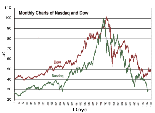
Mark Twain once said,
“History doesn’t repeat itself — at best it sometimes
rhymes.” This is clearly the case with the chart above. Just by glancing
at the examples, you can see that all three markets have followed roughly the
same path toward the peaks. It took the Dow and the Nikkei three years to double
before topping out, and it took the Nasdaq 17 months. All three markets saw
their worth multiply at unprecedented rates, and two of the corrections are
still in motion. By gauging the price action from these comparisons, we can try
to get some reasonable bearing on what might be to come.
The question on everyone’s
mind is, “How long will the bear market that began in 2000 last?†For a little
perspective, it has been 10 years since the Nikkei hit its peak, and it is still
50% below that mark. It took the Dow 25 years to fully recover from its ’29
crash. The Nasdaq
could do nothing for 10 years and still be on track with its 10%-12% a year
gains, given its huge increases over the past decade. That’s what
a bubble will do. History has shown us it takes a great
deal of time for the markets to digest the extreme valuations of manias.
Historically, the real
gains in the market have come at select times: 1921 to 1928, 1949 to 1966, and
1982 to 1999 have seen stocks gain an average of 13.8% a year, not including
dividends. Conversely, the bear markets of 1900 to 1920, 1929 to 1949, and 1966
to 1982 have produced slightly negative gains. With that said, there have been
long periods of time in the history of the markets where little progress has
been made, and very short periods where most of the gains
have been made. Further analysis accompanies the charts below:
The chart above compares
the recent Nasdaq action to the Dow crash of ’29. The study tracks the number of
days from the beginning of the bull market through the peaks (X axis), with the
percentage increases and decreases (Y axis). Notice the similarities of the
price action, especially in the movement before the peak. I find it amazing how
similar these charts look. It’s almost as if investors’
psyches haven’t changed at all. Eventually, the Dow sank to much lower
levels, and the Nasdaq has yet to surface from its losses, but this comparison
goes to show how history does in fact rhyme. Despite significant differences,
especially with the Dow being a reflection of an economic depression, we can use
the price action to potentially gauge where we stand now.
A typical bear
market lasts around two years, which keeps our current correction within that
category. There have been a total of nine bear markets in the past 50 years,
excluding the one we’re in now. What makes this market different is its
magnitude. The other corrections have been small compared to the mania that sent
the Nasdaq up over 3000% and down over 80%. When comparing this bear to the ’29
Dow bear, we can see the similarities in the rise, but the corrections have
stark differences. As we are still in a correcting phase, we can only hope our
losses won’t compare to the Dow’s, though it seems likely a full correction will
take some time.
Â

The chart above examines
the manias of the Nasdaq and the Nikkei. As in the comparison with the Nasdaq
and the Dow, this chart is structured to analyze the number of days from the
beginning of the bull phase, with their respective gains and losses in
percentage. This comparison also shows similarities in price action. No matter
what reasons or forces are attributed to the markets’ behavior, it is plausible
that they will continue to imitate one another. Though the Nasdaq has taken a
deeper cut, the Nikkei’s bear has been going on for much longer and still
remains in bear territory.
As in the comparison with
the Dow, there are some key differences. The Nikkei’s gain reached 3700% at its
peak, while the Nasdaq hit over 3075%. The two respective economies also have
different fundamentals which could be attributed to different speeds of
recovery. In looking at the chart, it seems that the Nasdaq’s climb was much
more intense, given its steep slope. The decline was also more profound,
indicating that the Nasdaq’s price action has been ahead of the Nikkei’s. If
this is the case, we will make a quicker recovery, but it is never that easy.
The Nikkei’s bear has been going on for over 10 years and is still under water.
A speedy recovery in the Nasdaq could happen and is certainly a widely hoped for
event. But consider what lessons we can learn from history about how long it can
potentially take.
Again, let me repeat:
Nothing is ever a given in the markets. The markets will do whatever they do,
and there is really no telling what will happen. Sometimes it is a good idea to
take a step back and take a look at the big picture. Trying to predict where the
Nasdaq may be five years from now may have no immediate affect on anyone’s
trading plan, but a little perspective is always healthy. History teaches us
what we have been capable of, and knowledge and experience can guide us to make
more risk-averse decisions. In other words, there is some comfort knowing just
what the parameters of past manias and crashes have been, but there is still no
telling precisely what the future will bring.
For The
Best Trading Books, Video Courses and Software To Improve Your Trading
Click Here
Â