Use PR Heat Maps to Gauge Market Direction
One of the most powerful ways to use our new
PowerRatings
Heat
Maps is to quickly gauge market direction. The PowerRatings
Heat Map can instantly reveal to a trader where market strength and weakness
lies, using PowerRatings as its primary function. By just looking at the Heat Map and comparing the number of red
squares to green ones, traders can get an instant visual projection of the
short-term probabilities of market direction, based on individual stocks’ PowerRatings.
 If you are unfamiliar with PowerRatings,
or how to use them, please refer to my
previous article.
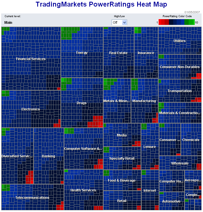
Here is a screenshot of the Heat Map from the
close on 1/05/2007:

The green squares (stocks with PowerRatings of 9
or 10) are outnumbering the red squares (PowerRatings of 1 or 2), which tells us
the markets are likely to move upwards over the next 5-8 trading days. The Energy
and Metals and Mining sectors appear to have the strongest short term outlooks,
while Drugs and Diversified Services are showing the most weakness.
Over the next few weeks I will be bringing you
more strategies on how PowerRatings
Heat
Maps can help you find stocks ready to move and ways to time your entries.
Click here to start a free trial to PowerRatings and find stocks which have
historically outperformed the market.
Attend a free class on how to use
PowerRatings, presented by Steve Primo, our Director of Education.
Darren Wong
Associate Editor
Would you like to receive PowerRatings for full month for free? Send us your
PowerRatings strategy and if we accept it for publication, you will receive one
free month of unlimited access to PowerRatings. If you are already a monthly or
annual PowerRatings subscriber, you will receive an additional three months if
we publish your strategy.
Â
