Using Volume Indicators To Improve Trading
Price and volume are the two basic building blocks for technical analysis. This article will discuss the 3 main volume indicators and how to use them to improve your trading.
First, exactly what is volume as it applies to the market? Volume is the total number of shares/contracts traded within a specified timeframe. The higher the volume, the greater the liquidity. Generally, the higher the liquidity the lower the volatility, with volatility being the size of price moves. Higher the volatility, the less the liquidity in most situations.
Click here to order your copy of The VXX Trend Following Strategy today and be one of the very first traders to utilize these unique strategies. This guidebook will make you a better, more powerful trader.
In the most basic form, traders like to see volume slowly increasing in the direction of a trend. A volume spike can indicate the end of a trend and declining volume can reflect a soon to die move. I believe the 3 primary volume indicators are: On Balance Volume, Accumulation/Distribution Line, and Ease of Movement. The following is a brief description and example of how you can use each one to improve your trading.
On Balance Volume or OBV: Joseph Granville is credited with creating this volume indicator tool in his 1963 book. “New Key To Stock Market Profits.” It remains one of the most popular volume indicators to this day. Its function is to measure positive and negative volume, displaying it in graph form so that the trader can determine if money is flowing into or out of a stock or contract.
The underlying logic is extremely simple, it adds a period’s volume when the close is up and subtracts a period’s volume when the close is down. These figures are charted to create the OBV line which is compared and contrasted to price to find confirmations and divergences. The theory being that volume changes will pave the way for price changes. A rising OBV line and increasing prices confirms a strong trend. However, a falling OBV line and rising prices is thought to indicate a weak or soon to fail trend.
Here is an example of OBV in action. The stock is ^C^, and you can see how price trended down in March, up in April and then down in May/June. Note how the OBV line follows price in both rising and falling markets.
Accumulation/Distribution Line: This indicator was created by Technical Analysis Marc Chaiken. It attempts to measure money flow into and out of stocks/contracts. The difference between OBV and the A/D line is it takes opening and closing prices into the calculation ( range). The calculation is (close-low) – (high-close)/(high-low) X volume in the period. This figure is then plotted in line graph form, similar to the OBV indicator. It’s generally used as a divergence indicator. A bearish signal is given when the A/D line is moving downward, yet price is moving up. Bullish indication would be an upward movement of the A/D line combined with a declining price. The primary issue with the A/D line is it doesn’t reflect price gaps. A stock that gaps then closes within the range will not be shown in the A/D line. Even a series of such gaps will not be indicated with this volume indicator.
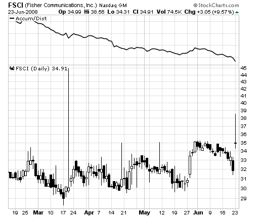
In this example of ^FSCI^. FSCI, you can see the A/D line trending downward, yet price is moving up. This is a bearish signal, and traders who follow this indicator would consider shorting here.
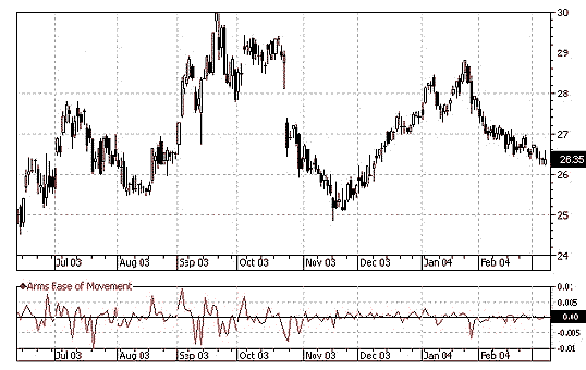
Ease of Movement EOM: This indicator reflects the amount of volume that is required to move price. It was developed by Richard Arms to show the relationship between volume and price change. Arms is more widely recognized as the creator of the Arms index or TRIN.
EOM is plotted on a graph with a midpoint of zero. It is graphed in line format and normally smoothed with a 14 day moving average. When price is moving up on light volume, Ease of Movement indicator shows high values above zero. Low values are shown when price is moving downward on light volume. If it takes lots of volume to move price, the indicator stays near zero. Signals are given to go long when the EOM line crosses above zero and short when it crosses below zero.
David Goodboy is Vice President of Marketing for a New York City based multi-strategy fund.